Open Graph image sizes: a resizing plan for SERP and social
Use Open Graph image sizes to plan variants for Twitter cards, thumbnails, and in-article images that load fast, look sharp, and improve CTR.
Why one image rarely works everywhere
An image can look perfect on your page and still fall flat on social or search. The reason is simple: every placement has a different box. Some are wide, some are square, and many will crop the center without warning.
Most platforms won’t show your full image. They resize it, crop it to a fixed ratio, and sometimes add padding, overlays, or rounded corners. A wide hero banner can turn into a messy thumbnail where the subject is cut off and any text becomes unreadable.
Your “post image” usually appears in a few different spots:
- Social previews (Open Graph and Twitter/X cards)
- Search results and feed thumbnails
- The featured image on your site
- Inline images inside the article
Even within social, rules vary. Open Graph previews tend to favor a wide rectangle, while other placements can show a square crop or a shorter version of the same image. If your subject sits off to one side, auto-crop can slice it in half.
Picture a hero image: a person on the left, a short headline on the right, and a clean background. Full-width, it works. As a small square thumbnail, the person becomes a shoulder, the headline disappears, and the image turns into a vague patch of color. People scroll past because they can’t tell what it is.
That’s why image variants matter. “Variants” just means a small set of versions of the same visual, each resized and cropped for a specific use. The goal isn’t to create dozens of files. It’s to protect what makes the image work:
- A clear subject that stays in frame
- Text (if you use it) that stays readable
- A consistent style across social, search, and your site
When you plan variants up front, you stop fighting surprise crops later, and each placement gets a fair shot at earning the click.
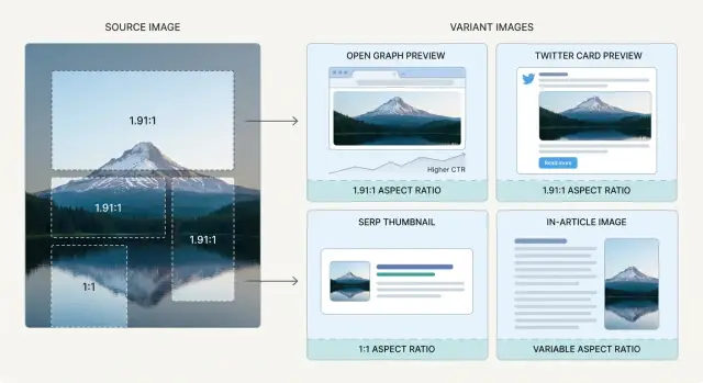
Where your images show up and what each spot needs
An image isn’t just decoration. It’s a preview, a thumbnail, a featured card, and sometimes a reading aid, all at once. Each spot has different crops, overlays, and viewing sizes.
Open Graph previews (social, chat, and share sheets)
Open Graph previews are what people see when your page is shared in messaging apps and many social feeds. The preview box often enforces a fixed aspect ratio, so if your image is too tall or too wide, platforms will crop it.
Design for a clean center area: one clear subject, optional short text, and enough padding so small trims don’t remove the key detail.
Twitter/X cards and UI overlays
Twitter/X layouts can cover parts of the image, especially near the edges. Corner details disappear easily, and thin lines near the bottom can look messy on mobile.
Think in terms of a “safe zone” instead of a perfect edge-to-edge crop. Keep faces, products, and any important text away from corners and close to the center.
SERP thumbnails and other tiny previews
Search thumbnails are small and easy to ignore. They reward simple shapes, strong contrast, and one obvious subject. A busy hero banner can look great on your site, then turn into visual noise at thumbnail size.
A thumbnail crop works best when it’s built around recognition, not detail. If you can’t understand it in a split second, it’s too wide, too busy, or too text-heavy.
In-article images: help the reader
Inline images should earn their place. Use them to explain, compare, or show an example, not just to fill space.
A simple rule: if removing the image wouldn’t change the reader’s understanding, it probably doesn’t belong.
Featured image vs inline image
Your featured image is your first impression across previews and thumbnails. Inline images are for clarity while reading. They often need different crops: featured images should be bold and simple, while inline images can be wider, more detailed, and closer to the content.
Decide your standard variant set (before you resize)
Before you export anything, decide what your standard set is. This saves time and keeps your visuals consistent across Open Graph, Twitter/X, search previews, and your own pages.
Start with one master source image you keep untouched. Make it large enough to handle crops without getting soft. A practical baseline is a master that’s at least 2000 px on the shortest side.
Next, pick a small set of aspect ratios you’ll always export. Don’t chase every platform edge case. A reliable set usually covers:
- Wide social preview (for Open Graph)
- 16:9 (for video-like placements and many embeds)
- 1:1 (for grids, many thumbnails, and app surfaces)
- 4:5 (for mobile-friendly social feeds)
- 3:2 (for cards and some listing layouts)
Then decide how you’ll adapt the master for each ratio:
- Crop when the subject is centered and there’s extra space around it.
- Pad (add background fill) when nothing can be cut off, like a logo or tight product shot.
- Re-compose when the layout includes text or multiple elements that need to stay readable.
If your images include text, re-compose is usually the only approach that holds up across sizes.
Finally, set a naming scheme you can follow without thinking. Keep it consistent so your CMS, template, or workflow can reliably pick the right asset and you can compare performance by variant later.
Step-by-step: build your image variants
Start with one master image that’s as large and clean as you can make it. Before resizing, get clear on what the image is really about: the main subject, any key text (if you use it), and the mood. If the subject isn’t obvious at a glance, resizing won’t fix it.
-
Make the wide social variant first. This is where Open Graph image sizes matter most, because platforms crop differently and show previews smaller than you expect. Keep the subject centered and leave safe space near the edges.
-
Create the Twitter/X version. Test it small on screen. If any text or important detail sits near the bottom corners, move it inward or remove it.
-
Build a square (or near-square) thumbnail. Thumbnails punish busy backgrounds. Crop tighter, enlarge the subject, and drop thin details. If you must use text, keep it to a few words.
-
Export the in-article image. This one should support reading flow. Keep it comfortable in width, avoid tiny baked-in captions, and make sure it doesn’t feel like an ad wedged between paragraphs.
After exporting, review at real sizes: a phone feed, a desktop preview, and your actual article column. Most “it looked fine in Photoshop” problems show up immediately when you do this.
Cropping rules that keep images readable
Cropping is where good images lose clicks. A crop that feels fine full-size can turn into a confusing blur as a thumbnail. The goal is straightforward: at a glance, people should know what they’re looking at.
Start from the smallest placement you care about (often a SERP thumbnail or small social preview). If the subject isn’t instantly recognizable, the crop is too wide or the subject is too small.
Safe zones: protect faces, logos, and the point
Platforms trim images unpredictably, and some add UI overlays. Give yourself margin so you don’t cut off foreheads, product edges, or key objects.
A practical habit that holds up across placements:
- Keep important elements inside the center 70-80% of the frame.
- Leave extra space at the edges, especially corners.
- Avoid putting faces, eyes, or logos tight against an edge.
- Choose one clear focal point.
Text in images: treat it like a headline
Small text inside images is a common trap. It can be readable on your monitor, then turn into fuzzy noise after resizing and compression.
If you use text, keep it short and bold, with strong contrast and breathing room. When possible, also export a text-free variant for small placements.
Backgrounds affect quality more than you think
Busy textures (grass, glitter, tiny patterns) often break into blocky artifacts when compressed. Cleaner backgrounds keep edges sharp and the subject clearer.
Example: you have a hero photo of a person holding a phone with a dashboard. For a thumbnail, crop tighter to the face and phone, simplify the background, and avoid relying on tiny on-screen details. If you need a label, reserve it for larger social cards and keep it short.
Formats, compression, and metadata that affect CTR
The same picture can look sharp on your page, but blurry or heavy when shared. Formats, compression, and basic metadata often make the difference between a preview that earns clicks and one that gets ignored.
Pick a format based on the content
JPEG is usually best for photos and gradients because it keeps files small. PNG is better for graphics with text, logos, or flat colors, but file sizes can jump fast. WebP and AVIF often give better quality at smaller sizes, but it’s still smart to keep a fallback for places that don’t support them.
Compression: set targets per placement
Compression isn’t one-size-fits-all. A tiny thumbnail can handle aggressive compression because it displays small. A large social preview needs more care because artifacts show up around faces and text.
If you want a simple rule of thumb, compress based on the smallest real-world view:
- Thumbnails: prioritize file size, accept slight softness
- Social cards: protect faces and any text from artifacts
- In-article images: balance quality and speed, especially on mobile
Metadata that helps people and systems
Consistency builds recognition. Keep color, contrast, and general style similar across posts so your images feel like they belong together in feeds and lists.
Also keep the basics tidy:
- File names: include the post slug and variant
- Alt text: describe what’s actually in the image, not keywords
When these are consistent, you spend less time hunting for assets and more time testing what actually improves CTR.
Common mistakes that lower clicks
The biggest mistake is making one “master image” and letting every platform crop it automatically. What works as a wide blog header can become a random zoom in a square thumbnail or cut off the subject in a social preview.
Over-design is another quiet killer. Big logos, long headlines, and tiny badges can look fine on desktop, then turn into a blur on a phone.
Quality also drops fast when you export too small and upscale later. Upscaling softens edges and muddies faces. Start from a large master and resize down per variant.
Style mismatches matter, too. If your Open Graph preview is bright and clean but your Twitter/X crop is darker with different colors, people feel the inconsistency. Keep the same photo treatment and layout rules across your set.
Finally, don’t skip mobile checks. An image that feels balanced on desktop may hide key detail behind UI overlays on mobile.
Quick checklist before you publish
Right before you hit publish:
- Zoom out until the image is thumbnail-sized. Can you still recognize the subject? Can you read any text without squinting?
- Confirm your safe area. The subject and any important text should sit away from edges.
- Check file size versus quality. Avoid obvious blocky artifacts, especially on faces and gradients.
- Look at the in-article version in context. If it’s very tall, it can push content down and feel like an ad.
- Verify real previews after publishing. This is where “correct size” files can still fail due to platform crops.
Do one final reality pass: open the article on your phone and desktop, scroll once, and notice what feels off. If it grabs attention for the wrong reason (too bright, too tall, unreadable, tiny subject), adjust the crop first, then tweak compression.
A realistic example: turning one hero image into 4 variants
Imagine a post announcing a new feature. Your hero image shows a person on the left holding a laptop, with a product screenshot on the right. Full-width, it looks great. Reused everywhere, it falls apart.
Start with a clean master (high-res, no text baked in). Then create four variants with intentional crops:
- Open Graph share preview: 1200x630
- Twitter/X card: 1200x675 (or reuse 1200x630 if needed)
- SERP or listing thumbnail: 600x600 (or 400x400)
- In-article image: 1600x900 (or match your content column)
For the wide Open Graph crop, don’t center the screenshot by default. Keep the person’s face and the key product area inside the safe zone (roughly the middle 70%). If the laptop screen is angled, crop tighter so the main UI panel is still readable in a small preview.
For the square thumbnail, drop tiny UI details. Thumbnails are about recognition, not explanation. Crop to the face plus one bold product shape (a chart, a headline area, a single card). If the screenshot is the whole point, consider using a blurred photo background and one crisp UI block.
For the in-article version, prioritize clarity over drama. Use a calmer crop, reduce background clutter, and keep brightness high enough that the screenshot reads on a white page.
Next steps: test, iterate, and automate at scale
Treat image variants like headlines. Measure, tweak, and keep what works.
Start with pages that already get impressions but few clicks. If a page ranks but has low CTR, the preview image is often too dark, too busy, or cropped in a way that hides the subject.
Keep tests small. One change at a time is enough to learn:
- Crop slightly tighter or wider
- Lift brightness and contrast for feeds
- Simplify backgrounds
- Change the focal point (person vs product vs a single UI element)
If you publish at scale, it helps to standardize the variant set and generate it the same way every time. A tool like GENERATED can handle repeatable variant creation (including resizing and polishing) and help you track which visuals underperform so you know where to test next.
FAQ
Do I really need multiple image sizes for one blog post?
Create a small set of intentional variants. A practical default is a wide social preview for Open Graph, a 16:9 option, a square thumbnail, a taller 4:5 crop for mobile feeds, and one in-article size that matches your content column.
What’s the best way to choose the right crop for social previews?
Start with your smallest real placement (often a SERP thumbnail or small feed preview) and make sure the subject is instantly recognizable there. Then build the wide Open Graph crop and keep key details inside a centered safe zone so unpredictable platform cropping doesn’t cut them off.
How big should my “master” image be before I make variants?
Use a large, untouched master image so every variant is a downscale, not an upscale. A solid baseline is at least 2000 px on the shortest side, which gives you room to crop to different ratios without the image getting soft.
What usually goes wrong with Open Graph images when people share a link?
Open Graph previews tend to favor a wide rectangle, and platforms may crop your image to fit their fixed ratio. Design around a clear center area, keep important elements away from edges, and avoid relying on tiny details that won’t survive compression.
How do I keep Twitter/X cards from hiding important parts of my image?
Assume parts of the image near edges can get covered by UI or trimmed differently across devices. Keep faces, logos, and any text away from corners, and test the card at small sizes so you catch problems that don’t show up in a full-size edit view.
Why do my images look fine as a hero but terrible as a thumbnail?
Make the thumbnail about recognition, not detail. Crop tighter, enlarge the main subject, simplify the background, and avoid long text; if you need words, keep it to a few bold ones with strong contrast.
Should I export a version with no text in the image?
Yes, especially if you use text at all. A text-free version is safer for thumbnails and unpredictable crops, while a text version can work on larger social cards where it stays readable.
When should I crop vs pad vs re-compose an image?
Crop when you have extra space and the subject can stay centered without losing meaning. Pad when nothing can be cut off, like a logo or a tight product shot, and re-compose when you have multiple elements or text that must stay readable across sizes.
Which image format should I use for social cards and blog images?
Use JPEG for photos and gradients to keep files smaller, and PNG for flat graphics, logos, or text-heavy images where crisp edges matter. WebP or AVIF can look better at smaller sizes, but it’s still smart to keep a compatible fallback for places that may not support them.
What’s the fastest pre-publish checklist to avoid low-CTR images?
Check the image at real sizes on a phone feed, a desktop preview, and inside your actual article layout. If the subject isn’t clear as a thumbnail, if key elements sit too close to edges, or if compression causes visible blocky artifacts, fix the crop first and then adjust compression.