Image SEO for Blog Graphics: Names, Alt Text, WebP/AVIF
Image SEO for Blog Graphics made practical: naming rules, alt text that fits the image, ideal sizes, and WebP/AVIF choices with a repeatable branding workflow.
What goes wrong with blog images (and why it matters)
When people talk about image SEO for blog graphics, they usually want three things: images load fast, they clearly reflect what the page is about, and search engines (plus social apps) can interpret them correctly.
The most common failure is simple: images get treated like decoration. Someone uploads a huge file named something like "final-final-2.png" and leaves the alt text blank (or fills it with keywords). The page loads slower, the image looks fuzzy on some screens, and the post misses chances to show up in image search.
Bad image choices also hurt how your post looks where people discover it. Your graphics might show up as a thumbnail in search results, a preview card in messaging apps, or the hero image at the top of the article. If that image is heavy, oddly cropped, or unclear, fewer people click.
Most problems are fixable if you catch them early:
- Files are too large, so pages feel slow on mobile.
- Meaning is missing, so search engines and screen readers get nothing useful.
- Sizes are inconsistent, so layouts jump or images look stretched.
- Style is inconsistent, so the blog feels random instead of like one brand.
You don't need perfection. You need a repeatable habit: fast load, clear meaning, and a consistent look readers recognize across posts.
File naming that stays clean and searchable
A good file name is a small thing that pays off for years. It helps you find assets later, helps teammates understand what an image is, and adds useful context for search engines.
Use real words that match the page topic, not camera IDs (like IMG_4920) or random strings. Keep it short and specific. If the post is about WebP vs AVIF, the file name should reflect that idea, not an internal project code.
Hyphens are the safest separator because they read like spaces. Stick to lowercase. Avoid special characters (%, &, ?, commas), and skip accents if you can. Also avoid keyword stuffing. One clear phrase beats a long chain of terms.
Include a size or version only when it prevents mistakes. Responsive images often produce several sizes, so baking dimensions into the main name usually creates clutter. Add a suffix when you truly have different variants people could mix up, like a dark vs light background or an updated chart.
A simple template you can reuse:
<topic-or-post-slug>-<what-it-shows>-<variant>
Examples that stay clean:
- webp-vs-avif-format-comparison-chart
- image-seo-alt-text-example-screenshot
- responsive-images-hero-illustration-dark
- blog-graphics-brand-template-cover
- compression-quality-check-zoom-200
Alt text and captions people can understand
Alt text is mainly for people who use screen readers and for cases when an image doesn't load. That means it should describe what's actually visible, not what you wish the image said. If you treat it like a place to stuff keywords, it becomes noisy and unhelpful.
A good rule: write one clear sentence that answers, "What is this image?" If a person, product, or brand element is visible, name it. If something is happening, say what is happening. Skip filler like "image of" or "graphic showing."
Decorative images are different. If an image adds no information (a background pattern, a divider, a purely decorative icon), use empty alt text (alt="") so screen readers can skip it. Don't leave it missing by accident; choose empty alt on purpose.
Alt text, captions, and surrounding text do different jobs:
- Alt text is for accessibility and fallback.
- Captions are for everyone and can add context the image alone can't.
- Surrounding text explains the point and connects the image to the section.
Quick "bad vs good" examples for common blog graphics:
- Chart: Bad: "best image seo webp avif ranking". Good: "Bar chart comparing WebP and AVIF file sizes for the same hero image."
- Screenshot: Bad: "blog generator software". Good: "Screenshot of the blog editor with title field, image picker, and publish button."
- Hero illustration: Bad: "Image SEO for Blog Graphics". Good: "Illustration of a camera icon next to a filename tag and an alt text label."
- Team photo: Bad: "marketing team meeting". Good: "Three people reviewing a content calendar on a laptop at a meeting table."
- Decorative shape: Bad: "blue gradient background". Good: alt="" (decorative)
If you create images at scale, a tiny style guide helps: one-sentence alt text, plain words, and consistent naming for recurring elements (logo, product UI, charts).
Image sizes and responsive behavior without the jargon
Most image issues come from one of two extremes: exporting one huge file for everything, or exporting one small file and stretching it until it looks soft. Consistency fixes both.
Pick a small set of standard widths and stick to them. That keeps performance predictable and reduces one-off exports. A practical set is:
- 480px (small cards, mobile)
- 768px (most in-article images)
- 1200px (hero images)
- 1600px (large heroes or full-width layouts)
Different placements need different treatment. A hero image is often wide and can handle more detail. An in-article image should be readable without forcing people to zoom. A thumbnail should be simple and high-contrast because it's often seen at a tiny size.
Responsive images just means: send a smaller file to a small screen and a larger file to a large screen. You offer a few sizes, and the browser picks the best one automatically. That keeps pages fast without sacrificing clarity.
Cropping vs resizing: resize when you want the same framing, only smaller or larger. Crop when the shape changes (for example, turning a wide hero into a square thumbnail). If you skip cropping, the thumbnail often becomes unreadable because the subject shrinks too much.
To avoid blur on high-resolution ("retina") screens, make sure your largest served size is at least 2x the displayed size. Example: if a hero shows at 1200px wide on desktop, have a 2400px source available, then use compression to bring the file size back down.
Choosing formats: WebP, AVIF, JPEG, PNG, SVG
Picking the right image format affects load time, clarity, and how often people bounce before the page finishes loading.
WebP is a safe default for most blog images. It keeps files small and usually looks good for photos, screenshots, and simple graphics.
AVIF can be even smaller than WebP at the same quality, especially for large photos and gradients. The tradeoff is slower encoding and a higher risk of looking bad when compressed too hard (skin tones and subtle textures can look a bit "waxy"). Many teams reserve AVIF for big visuals where the size savings matter most.
JPEG still makes sense for photos when you need maximum compatibility or fast processing. PNG is a good choice for graphics that need transparency (like a logo on top of a background) or when crisp edges matter more than file size. SVG is ideal for icons and simple shapes because it stays sharp at any size.
Practical format decision table
| Use case | Best choice | Why | Watch out for |
|---|---|---|---|
| Photos (blog header, lifestyle shots) | WebP (or AVIF for large headers) | Small files, good quality | Over-compression artifacts |
| Screenshots (UI, dashboards) | WebP | Good balance, handles text well | If text looks fuzzy, increase quality |
| Graphics with transparency (badges, overlays) | PNG (or WebP if it preserves transparency well in your workflow) | Keeps transparent background | PNG can be heavy |
| Logos and icons | SVG | Tiny, sharp at all sizes | Keep it simple; complex SVGs can bloat |
| Charts with fine lines | SVG (or PNG) | Crisp lines and labels | Don't export as low-res JPG |
Compression and image quality checks
Compression makes image files smaller so pages load faster. Done well, it shouldn't change what the image is saying. Colors stay believable, edges stay clean, and important details remain easy to see.
A practical way to choose quality is to start a bit higher than you think you need, then lower it until you can just barely spot a problem, and go one step back. The right number depends on the image, so trust your eyes more than a rule of thumb.
Look for artifacts that hurt trust and readability: color banding in gradients (like skies), halos around cutout subjects, and soft or smeared edges. Text is the easiest place to see problems. If your image contains small text, compression often makes it fuzzy.
Small text inside images is risky for another reason: it doesn't scale well on phones and it isn't searchable. If the words matter, put them on the page as real text and keep the image as a visual. If you truly need text baked in (like chart labels), make it larger and consider a format that keeps edges crisp.
A quick before-and-after check that prevents overthinking:
- Open the original and compressed versions side by side.
- Zoom to 100% and scan faces, gradients, and edges.
- View on both light and dark backgrounds.
- Shrink to phone size and see if the message still reads.
- If you notice issues in under 5 seconds, raise quality slightly.
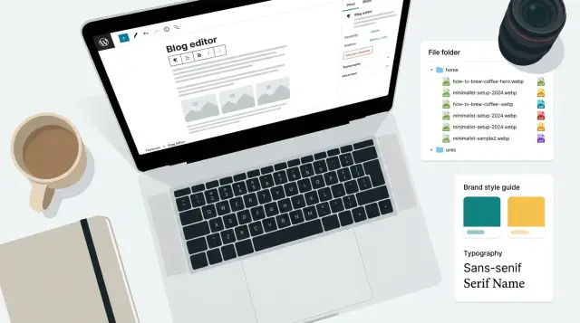
Workflow for consistent visual branding
Consistent visuals make your posts feel like they come from the same place, even when topics change. They also make image SEO easier because you're repeating the same patterns, which makes naming, sizing, and alt text more predictable.
Start with a one-page style guide that anyone can follow. Keep it simple: 2 to 3 brand colors (plus neutrals), 1 to 2 fonts, and a few spacing rules. Decide early on details like corner radius, shadow strength, and whether you use outlines or filled shapes. Those small choices are what make images feel "matched."
Create a handful of reusable templates so you're not reinventing the wheel every time. Most blogs get a lot of mileage from:
- A hero image template
- A quote card
- A steps graphic (3 to 5 steps)
- A simple chart-style visual
- A small feature callout or badge
Set rules for icons and illustrations. Pick one style and stick to it. If you mix styles, do it intentionally (for example: line icons only, and photos only when they are real screenshots).
Keep a small library of approved elements: backgrounds, gradients, shapes, badges, and an icon set. Store them with clear names so people don't grab random assets that look "close enough."
For seasonal campaigns, change only one layer, not the whole system. Swap an accent color, add a small seasonal badge, or use a limited set of backgrounds. When the campaign ends, you remove the seasonal layer and your core brand look stays intact.
Step-by-step: a repeatable process for every blog post
Consistency is what makes this work. If you do the same small steps every time, you avoid messy filenames, vague alt text, and random image sizes that slow pages down.
A 5-step routine you can reuse
Before you design anything, decide what each image is supposed to do: one hero image that explains the topic fast, a few supporting images that clarify sections, and one social share version (often a tighter crop).
Draft the words early. Write filenames and alt text while the idea is fresh, not after you export. Example: if the post is about WebP vs AVIF, plan webp-vs-avif-size-chart.webp with alt text like "Chart comparing WebP and AVIF file sizes for the same photo."
Then export in a small set of sizes so your site can pick the best one for the screen:
- Assign roles (hero, supporting, social).
- Confirm naming and alt text before exporting.
- Export small, medium, and large versions in your primary format.
- Compress, then do a quick visual check at 100% zoom.
- QA the final set: naming, alt text, dimensions, and consistent styling.
After compression, do a 30-second "human check": can you read any text, do faces look natural, are backgrounds clean, and does it match your brand (colors, fonts, spacing)?
Finally, spot-check on the page before publishing. Confirm file names match the post, alt text describes the image (without keyword stuffing), dimensions are correct, and the set feels like it belongs together.
Example: one blog post, five images, done consistently
A weekly post titled "WebP vs AVIF: what to use for blog graphics" often needs five visuals: one hero image, three in-article images, and one social preview. Treating this as a small system makes the work faster and the series more recognizable.
Start by picking one slug and using it everywhere: webp-vs-avif-blog-graphics. Then name each file for what it is and where it appears:
- Hero:
webp-vs-avif-blog-graphics-hero.webp| Alt: "Side-by-side comparison of the same blog graphic saved as WebP and AVIF" | 1600x900 | WebP (AVIF if supported) - In-article #1:
webp-vs-avif-blog-graphics-format-table.avif| Alt: "Table comparing WebP and AVIF file size and quality at the same resolution" | 1200x675 | AVIF - In-article #2:
webp-vs-avif-blog-graphics-responsive-sizes.webp| Alt: "Example of one image served in multiple responsive sizes for desktop and mobile" | 1200x675 | WebP - In-article #3:
webp-vs-avif-blog-graphics-export-settings.png| Alt: "Export settings screen showing quality and metadata options for web images" | 1200x675 | PNG (only if text must stay perfectly sharp) - Social preview:
webp-vs-avif-blog-graphics-social-1200x630.jpg| Alt: "Social preview card with the post title and a small WebP vs AVIF label" | 1200x630 | JPEG
Branding stays consistent when every image comes from the same template set: a fixed font pair, two brand colors, and a safe area so text doesn't get cropped in social previews.
Common mistakes and easy fixes
The fastest way to lose image SEO value is to treat images like an afterthought. A few small habits keep pages lighter, clearer, and more consistent.
Keyword stuffing is the big one. Filenames like best-image-seo-for-blog-graphics-best-seo.png and alt text that reads like a list of phrases look spammy and help nobody. Name the file for what it is, and write alt text like you'd explain the image to a friend who can't see it.
Another common issue is uploading huge images and letting the page shrink them. A 4000px image displayed at 800px still forces people to download the big file. Export at the sizes you actually need and use responsive image sizes so phones don't download desktop assets.
Text-heavy graphics also backfire. A quote card with tiny text may look fine on a laptop but becomes unreadable on mobile. Keep text short and large, or move detail into a caption. If the image must include text, preview it at phone width before publishing.
Style drift is subtle but hurts branding. Random colors, mixed fonts, and inconsistent margins make a blog feel stitched together. Pick a small set of rules (2 fonts, a limited palette, standard padding, consistent corner radius) and reuse templates.
Finally, test previews and dark mode. Some images wash out on dark backgrounds, and social previews can crop key details. Check a dark theme and confirm the focal point still works when cropped to a wide preview.
Quick checklist before you publish
Use this as a final 2-minute pass before you hit publish:
- Filename: Uses your naming template and clearly matches the page topic (no "final-final-2").
- Alt text: Accurate and short. If the image is decorative (background, divider, pattern), leave alt text empty.
- Sizes: Exported at the right display size, with at least one smaller version ready for responsive use.
- Format + compression: WebP or AVIF where it makes sense, compressed without obvious blur, banding, or crunchy edges.
- Brand check: Same colors, type choices, and spacing rules as your other posts.
After that, spot-check on mobile and desktop. On mobile, look for cropped text, tiny labels, and images that push the first paragraph too far down. On desktop, look for images that are larger than needed or appear soft because they're being stretched.
Next steps: standardize, scale, and keep improving
If you want this to stay consistent as you publish more, treat it like a small system. The goal is simple: every image ships with the same basics done well, without extra thinking.
Start with a short internal standard that anyone can follow on a busy day. Include your naming pattern, alt text rules, default sizes (hero, inline, social), preferred formats, and a quick pre-publish check for spelling, contrast, and cropping.
Then pick three reusable templates and commit to them for a month. A simple title card, a chart-style visual, and a photo-with-label layout is enough for many blogs. Consistent templates make your brand feel familiar, and they also make alt text and naming faster because the structure repeats.
To scale, batch the work: plan images for the whole post, export the full set of sizes, compress them, and QA them as one group. Track outcomes too, like clicks from posts with strong thumbnails and which visuals get reused or shared.
If you want an all-in-one way to generate and maintain this kind of consistency, GENERATED (generated.app) supports content generation plus blog image generation, resizing, polishing, and performance tracking, which can help you keep the workflow repeatable as your publishing volume grows.
FAQ
What’s the biggest mistake people make with blog images for SEO?
Treat each image like content, not decoration. Use a clear filename, accurate alt text, the right dimensions for where it appears, and a modern format with sensible compression so it loads fast and stays sharp.
How should I name image files so they stay searchable later?
Use a short, descriptive phrase that matches the post and what the image shows, like webp-vs-avif-format-comparison-chart.webp. Keep it lowercase, use hyphens, avoid special characters, and skip keyword stuffing.
What’s the simplest way to write good alt text?
Write one clear sentence describing what’s visible and important in the image, as if you’re explaining it to someone who can’t see it. Don’t add filler like “image of,” and don’t turn it into a keyword list.
When should an image have empty alt text?
Use empty alt text (alt="") when the image adds no information, like a background pattern, divider, or purely decorative shape. Empty alt is better than missing alt because it tells screen readers to skip it on purpose.
Do I need captions if I already have alt text?
Alt text is for accessibility and fallback when the image can’t be seen. Captions are for everyone and are useful when you need to add context, explain a takeaway, or clarify what the reader should notice.
What image sizes should I standardize on for blog posts?
Pick a small set of standard widths and reuse them across posts so performance stays predictable. A practical set is 480px, 768px, 1200px, and 1600px, then let your site serve the best size for each screen.
When should I crop an image instead of just resizing it?
Resize when you want the same framing at a different size. Crop when the shape changes, like turning a wide hero into a square thumbnail, because shrinking without cropping often makes the subject unreadable.
Should I use WebP or AVIF (and when do JPEG/PNG/SVG still matter)?
WebP is a solid default for most blog images. AVIF can be smaller for large photos and gradients but can look “waxy” if over-compressed; PNG is best when you need transparency or very crisp edges; SVG is ideal for icons and simple charts.
How do I compress images without making them look bad?
Compress until you can barely spot quality issues, then step back slightly. Check at 100% zoom for banding in gradients, halos on edges, and fuzzy text, and also preview at phone size to confirm the message still reads.
How do I keep blog images consistent across posts without extra work?
Create a small style guide and a few templates (hero, quote card, steps graphic, simple chart) so visuals repeat the same fonts, colors, spacing, and icon style. Then use a consistent routine: assign image roles, name files, write alt text early, export standard sizes, compress, and do a quick on-page check including social preview crops.