CTA performance tracking beyond clicks: what to measure
CTA performance tracking beyond clicks: what to measure (scroll depth, time on section, assisted conversions) and how to read results by page type.
Why clicks aren't enough for CTAs
Clicks are easy to count, but they’re a shaky stand-in for real intent. People click out of curiosity, mis-tap on mobile, or open something “to check later” with no plan to sign up or buy. If you judge a CTA only by clicks, you can end up rewarding the wrong message and hiding the right one.
Good CTA performance means progress toward a goal, not just motion on the page. That goal could be a signup, a demo request, an email opt-in, or even “read the next section” on an educational page. Tracking works best when you treat a click as one signal, then confirm whether people actually engaged and moved forward.
Page intent changes what “success” looks like. A blog post is usually awareness. A pricing page is decision-focused. A glossary page might be purely informational and still valuable if it warms up visitors who convert later.
A practical way to stay honest is to look at three buckets together:
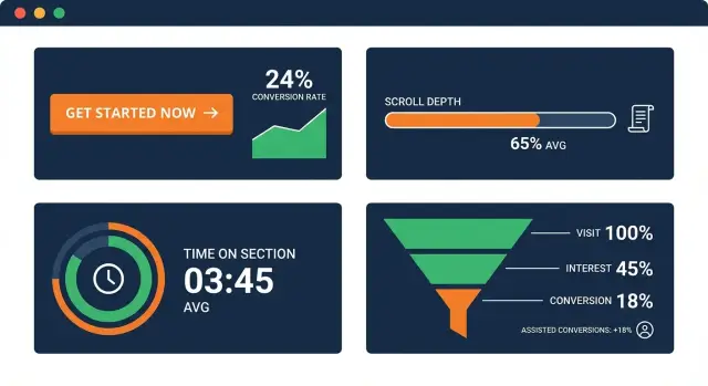
- Attention: did visitors reach and view the CTA (scroll depth, CTA view, time before reaching it)?
- Engagement: did they interact in a meaningful way (time on section, expanding FAQs, video plays, form start)?
- Outcomes: did the visit contribute to the goal (signups, qualified leads, assisted conversions)?
A simple example: a blog CTA that gets fewer clicks than expected might still be doing its job if most readers reach it, spend time in the section, and later return through another page to convert. Meanwhile, a high-click CTA on a mobile-heavy page might be mostly accidental taps if time on section is low and bounce-back is immediate.
Define your goals and what success looks like
Before you look at any numbers, decide what each CTA is supposed to do. A “Book a demo” button and a “Download the checklist” button can both be useful, but they’re not the same kind of win. If you treat them as equal, you’ll overvalue easy actions or undervalue the ones that actually drive revenue.
Start by naming the primary conversion for the page: the action you’d be happy to pay for (purchase, demo request, trial start, qualified lead). Then choose a small set of micro-conversions that signal progress, like an email signup, a download, or a click to view pricing.
One rule keeps CTA performance tracking readable: pick one goal per CTA. If one button is meant to do three things (download, subscribe, and request a call), you’ll never know what improved when the metric moves.
It also helps to define when a CTA truly “had a chance.” In plain terms:
- Seen: the CTA entered the viewport.
- Read: the surrounding section was viewed long enough to understand the offer.
- Interacted: hover, expand, tap, or click (depending on the CTA format).
- Completed: the intended action happened (submit, signup, download).
Attribution is the other part of success. Keep it simple and consistent:
- First touch: the first page or CTA that started the journey.
- Last touch: the final page or CTA right before conversion.
- Assist: any page or CTA that helped along the way.
Example: on a blog post, the main CTA might be “Start free trial,” while a mid-article CTA might be “Get the template.” The template download can be a micro-conversion that assists trials later, even if it doesn’t close the deal that day.
The metrics that matter beyond clicks
CTA performance tracking gets much clearer when you treat a click as just one signal, not the final verdict. Many CTAs do their job by building intent, answering doubts, or nudging someone to come back later.
Start with visibility. A CTA can’t work if it wasn’t on screen. Track CTA impressions (the CTA entered the viewport) instead of assuming every pageview had a chance to see it. This matters on long pages, pages with sticky headers, and pages with multiple CTAs.
Then add a few progress metrics:
- Scroll depth for CTAs: did people reach the part of the page where the CTA sits?
- Time on section metric: once they reached the CTA area, did they pause long enough to read and consider it?
To capture interest without forcing a click, measure light engagement actions that fit your content. For example: focusing on the CTA, expanding an FAQ near it, starting a form, or opening a pricing table.
Finally, track outcomes, including those that happen later. Direct conversions (signup, purchase, lead) are the clearest, but assisted conversions and return visits often tell the real story for top-of-funnel pages.
How to read scroll depth and time on section
Scroll depth is a simple proxy for attention: how far people got before they left. If your CTA sits near the bottom and most visitors stop at 30% scroll, low clicks don’t mean the CTA is “bad.” It may just be unseen.
Scroll depth also has limits. Some readers skim fast, some jump using a table of contents, and some scroll to the end and bounce. Treat scroll depth as exposure potential, not proof of interest.
Time on section answers a different question: once someone reaches the CTA area, do they pause long enough to read and consider it? This is often more useful than time on page, which can be inflated by idle tabs, long articles, or distractions.
A practical way to combine them is to set a few simple thresholds, then compare pages by page type:
- 50% scroll reached: the visitor likely saw mid-page CTAs.
- 75% scroll reached: the visitor likely saw bottom CTAs.
- 10 seconds in the CTA section: enough time to read a short pitch.
- 20 seconds in the CTA section: stronger intent or careful evaluation.
Repeat exposure matters too. Returning users might scroll less (they already know the page) but spend more time around the CTA because they came back to act. If clicks are flat but time on section for returning users rises, you may be building trust and demand, just not converting on the first visit.
Example: on a glossary page, expect lower scroll but steady section time near definitions. On a long blog post, a high scroll drop-off can be normal, so focus on whether the CTA section gets meaningful time once reached.
Assisted conversions: what they mean and when to trust them
An assisted conversion is when a CTA helps someone move closer to converting, even if the final signup or purchase happens later on another page. A visitor might read a blog post, download a checklist, leave, then come back two days later and sign up from the pricing page. The blog CTA didn’t “win” the last click, but it still mattered.
Common assist paths look like this:
- Blog post -> pricing page -> signup
- Glossary page -> blog post -> demo request
- Comparison page -> case study -> contact form
- News update -> product page -> trial start
Assists are especially useful for CTA performance tracking on top-of-funnel pages, where the goal is momentum, not an immediate conversion. But they’re also easy to over-credit. A popular page can look like a hero even if its CTA is weak.
To keep assists honest, ask:
- Do people who saw or engaged with the CTA later convert at a higher rate than similar visitors who didn’t?
- Are assists concentrated around a few strong pages, or spread so widely that it’s probably background traffic?
- When you change CTA copy or placement, do assists move in the same direction?
Lookback windows matter. Use longer windows (14 to 30 days) when your product needs consideration and multiple sessions. Use shorter windows (1 to 7 days) for fast decisions, like a simple email signup.
Interpret results by page type
A CTA metric only makes sense in context. CTA performance tracking gets clearer when you compare like with like: the same page type, the same traffic source, and the same intent level.
What good looks like on different pages
- Blog posts: Treat the CTA as a helper, not a finisher. Clicks can be modest while assisted conversions are strong. If scroll depth drops before the CTA, move it earlier or add a lighter CTA mid-article.
- Landing pages: Expect more direct conversions and less wandering. Scroll depth often clusters (many people stop at the hero or the first proof block). Big scroll variance can mean the page is unclear, so visitors keep searching for answers.
- Pricing pages: Visitors are close to a decision. Small copy or placement changes can swing results. Watch time on section around plan comparison, FAQs, and the CTA area. High time on section with low clicks can signal confusion, not interest.
- Glossary and news pages: Intent is usually awareness, not buying. Softer CTAs (subscribe, get updates, try a tool) often win. Scrolling and time on section are meaningful success signals even when direct conversions are low.
- Home page: Intent is mixed, so split results by traffic source (brand search, ads, social, referrals). A CTA that works for returning users can fail for first-timers.
A quick way to interpret patterns
If scroll depth is high but CTA clicks are low, the offer may not match what the page promised. If time on section is high and assisted conversions rise, the CTA might be doing its job even without many clicks.
Example: a glossary page about IndexNow might show strong reading time but few “Book a demo” clicks. Swapping to a lighter CTA like “Get SEO content ideas” can lift sign-ups, while later conversion still happens from a pricing or product page.
Step by step: set up CTA measurement without overcomplicating it
A clean setup beats a fancy one. If you can answer “which CTA was shown, what did people do next, and in what context?”, you’re already ahead of most teams.
Start by giving every CTA a stable name that won’t change when the button text changes. For example: cta_pricing_header, cta_demo_sidebar, cta_newsletter_footer. Keep naming consistent across your site so reports don’t turn into a mess of near-duplicates.
Then track a small set of actions the same way everywhere:
- CTA view: the moment the CTA is actually visible (not just when the page loads)
- CTA click: the click or tap on the CTA
- Form start: first interaction with the form (if your CTA leads to one)
- Form submit: the completed signup, request, or purchase
- Confirm: the “thank you” or success state (useful when submits can fail)
Next, capture enough context to make the numbers meaningful. At minimum, store page type (blog, pricing, docs), traffic source (search, paid, email), and device (desktop, mobile). The same CTA can behave very differently on a blog post from search than on a pricing page from a retargeting ad.
Decide what counts as a conversion and how long you’ll give the CTA credit. If someone clicks a blog CTA today and buys within 7 days, do you count that as an assist? Pick one assist window (often 7 or 14 days) and stick to it so trends are real.
Finally, set a baseline and a review rhythm. Check weekly for quick issues (broken forms, sudden drops) and monthly for decisions (copy changes, placement tests).
Segmenting results so the numbers make sense
If you look at one blended CTA number, you often average away the story. Segmenting is how you turn CTA performance tracking into decisions you can act on.
Start with device. Mobile visitors often scroll differently, spend less time per section, and hesitate to fill forms. If a CTA works on desktop but not on mobile, the copy might be fine while the button size, spacing, or form length is the real problem.
Next, break results down by where people came from. Search visitors are usually colder and still deciding. Email or direct traffic is often warmer and more ready to sign up or request a demo. If search traffic shows high scroll depth but low sign-ups, the page may educate well but the offer might be too big for a first step.
New and returning visitors also behave differently. New visitors need clarity and proof. Returning visitors are more likely to respond to specific CTAs like “See pricing.” When you mix them, you can end up “fixing” a CTA that is already working for one group.
A small segmentation set that usually reveals the biggest gaps:
- Mobile vs desktop
- Search vs email vs social vs direct
- New vs returning visitors
Also treat placement as its own segment. Compare above-the-fold, mid-article, and end-of-page CTAs separately. A top CTA is judged on early intent. A mid-article CTA should match the moment the reader understands the benefit. An end CTA depends on completion, so evaluate it with scroll depth and assisted conversions, not just clicks.
Common mistakes and traps to avoid
Most CTA reports look clean until you ask one simple question: did the visitor even see the CTA? If you only count clicks, you can end up optimizing something that never had a fair chance.
These are the traps that most often break CTA performance tracking, even when the tracking setup is technically correct:
- Counting clicks without measuring visibility. Pair clicks with scroll depth or an impression event when the CTA enters the viewport.
- Changing three things at once. If you edit copy, move the CTA, and change design in the same release, you won’t know what caused the shift.
- Using time on page as “reading.” Prefer time on section plus scroll behavior.
- Declaring winners on tiny sample sizes. Wait for enough CTA views and enough conversions to reduce noise.
- Ignoring page type and traffic shifts. A glossary page behaves differently than a product page, and a traffic spike from social can change scroll depth without any real CTA problem.
A quick reality check: if a blog post’s CTA clicks drop but CTA visibility rises and assisted conversions stay flat, the issue might be the offer or wording. If visibility drops at the same time, placement or layout is the likely culprit.
Quick checklist for reviewing CTA performance
Use this checklist each time you review CTA performance tracking:
- Was the CTA actually seen? Check view rate (CTA shown events). If only a small share of visitors see the button, low clicks are expected.
- Do people reach the CTA area on this page type? Compare scroll depth patterns for blog posts vs landing pages vs pricing pages.
- Are non-clickers still valuable later? Look for assisted conversions: people who engaged but converted later on another page or visit.
- Are results stable across sources and devices? Split by mobile vs desktop and by traffic source.
- Did anything else change during the period? Layout shifts, offer changes, slower load times, and new campaigns can move the numbers more than the CTA itself.
If one metric looks bad, trace the chain: reach (scroll) -> see (view) -> engage (time on section) -> act now (click) or later (assist).
Example: reading the metrics on a real page
Picture a blog post that gets steady search traffic. It has one CTA halfway down (a simple banner) and another at the end (a “Try it now” button).
After two weeks, the numbers look odd if you only watch clicks. The mid-article CTA has a low click rate, and the end CTA is even lower. It would be easy to call both “bad” and delete them.
But when you add beyond-click metrics, the story changes. Many readers reach the middle CTA (good scroll depth), spend time around that section (time on section is higher than your page average), and a chunk of those readers return later and sign up from a different page. That’s an assisted conversion pattern: the CTA didn’t get the final click, but it helped.
Meanwhile, the end CTA is rarely seen. Scroll depth shows only a small share of visitors reach the bottom, so low clicks are expected. The CTA might be fine, but its placement is fighting the way people actually read.
A sensible next step is to make one change at a time:
- Keep the mid-article CTA and test a single improvement (shorter copy, clearer promise, or a different visual).
- Move the end CTA higher (for example, after the key takeaway), or replace it with a softer option if the page is informational.
- If assists are strong but clicks stay low, audit the next step. The landing page might be slow, confusing, or asking for too much.
If you publish content at scale and want a tighter loop between content, CTAs, and measurement, tools like GENERATED (generated.app) combine CTA generation with performance tracking, so you can review attention, engagement, and outcomes together without treating clicks as the only score.
FAQ
Why are clicks a bad way to judge a CTA?
Clicks are noisy: people click out of curiosity, by accident on mobile, or to “save for later.” A better read is whether the CTA was actually seen, whether people engaged with the surrounding content, and whether it contributed to a real outcome like a signup, demo request, or a later assisted conversion.
How do I decide what “success” means for a CTA?
Start by defining the primary conversion for the page (the action you’d pay for), then pick a couple of micro-conversions that signal progress. Keep it simple: each CTA should have one clear goal so you can tell what improved when the numbers change.
What’s the simplest way to measure if a CTA was actually seen?
Track when the CTA enters the viewport, not just pageviews. On long pages, many visitors never reach mid-page or bottom CTAs, so a low click rate might simply mean the CTA wasn’t seen.
How should I use scroll depth when evaluating CTAs?
Scroll depth tells you whether visitors reached the area where the CTA sits, which is mainly an exposure check. It does not prove interest, so use it to diagnose placement issues rather than to declare a CTA “good” or “bad.”
What is “time on section,” and why is it better than time on page?
Time on section measures whether people paused near the CTA long enough to read and consider the offer. It’s usually more reliable than time on page, which can be inflated by idle tabs, very long posts, or distractions.
What counts as an assisted conversion for a CTA?
An assisted conversion is when a CTA helps someone move closer to converting, even if the final signup or purchase happens later on a different page or session. It’s especially useful for blog and glossary pages, where the job is often to build intent rather than close immediately.
How do I keep assisted conversions from being misleading?
Compare people who saw or engaged with the CTA against similar visitors who didn’t, and check whether changes to the CTA move assist numbers in the same direction. Also use a consistent lookback window so you don’t over-credit random background traffic.
How should CTA metrics differ between blog posts and pricing pages?
Match expectations to intent. Blog, glossary, and news pages often perform better on attention and assists, while pricing and landing pages should show stronger direct outcomes; if you compare them directly, you’ll make the wrong calls.
What segments should I look at so CTA reports make sense?
Start with device, traffic source, and new vs returning visitors, because behavior can change a lot across these groups. A CTA can look “average” overall while clearly failing on mobile or working only for warm traffic like email and direct.
What’s a minimal tracking setup I can implement without overcomplicating it?
Track a small, consistent chain: CTA view (visible), CTA click (tap), and the real completion event (submit/success). Give each CTA a stable internal name, capture basic context like page type and device, and change one thing at a time when you test.