CTA copywriting for SEO pages: match CTAs to intent
CTA copywriting for SEO pages: learn to align CTAs with page intent, keep pages readable, and test variants safely using simple, practical steps.
Why CTAs feel wrong when they do not match intent
A CTA feels right when it matches why someone came to the page. If they searched to learn, they want clarity and a practical next step, not a pitch. If they searched to buy, they want proof and an easy way to act.
Most weak CTAs are not “bad writing.” They are the wrong ask for the moment. The page can be genuinely useful, but the CTA jumps ahead of the reader’s decision.
It helps to separate two things:
- The page goal: what the visitor is trying to accomplish right now (understand, compare, choose, sign up).
- The business goal: what you want (leads, trials, sales).
Good CTA copy meets the page goal first, then earns the business goal.
This is where CTAs on SEO pages often go off track. Search content is built to answer a question quickly. A CTA that interrupts that job feels like a pop-up in sentence form, even if it’s “just a button.”
Same offer, different fit:
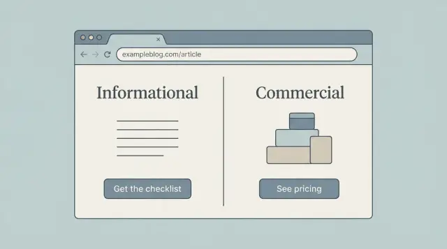
- Too pushy on an informational page: “Book a demo now” right after a basic definition.
- Helpful on an informational page: “Get the checklist version of this guide” or “See examples you can copy.”
- Too soft on a commercial page: “Read more articles” when the reader is comparing options.
- Helpful on a commercial page: “Compare plans,” “See pricing,” or “Start a free trial.”
A simple rule: if your CTA asks for commitment, the page must first do the work that makes commitment reasonable. If it doesn’t, the CTA reads like you’re talking past the reader.
When you create variants (manually or with a tool like GENERATED that can generate intent-aligned CTAs and track performance), keep one sentence in front of you: why did they come to this page? It stops you from turning every page into the same hard sell.
A simple way to classify intent on SEO pages
Before you write a CTA, pin down what the reader is trying to do on that page. CTAs work best when they match intent, not when they try to force a sale.
A practical method is to sort pages into three buckets.
The 3 intent types (and what the reader wants)
Informational intent means they want to learn the basics or fix something. Queries often include “what is,” “how to,” “why,” “examples,” “template,” or “troubleshoot.” The page promises explanations, steps, or definitions.
Commercial intent means they’re evaluating options and narrowing choices. Look for “best,” “top,” “vs,” “compare,” “alternatives,” “reviews,” “pricing,” or “features.” The page tends to include criteria, pros and cons, and “who it’s for.”
Transactional intent means they’re ready to act now: buy, book, sign up, or start a trial. Queries often include a product name plus words like “buy,” “order,” “demo,” “free trial,” “discount,” or “quote.” The page leans heavily on outcomes and next steps.
How to spot intent from the page itself
Use three clues together: the query (what brought them), the title (what you promised), and the headings (what you actually deliver). If two of the three point to the same bucket, treat that as the primary intent.
A fast check:
- Does the query sound like a question (informational), a shortlist (commercial), or a command (transactional)?
- Does the title promise learning, choosing, or starting?
- Do headings teach steps, compare options, or push conversion details?
- Is the first screen answering a question or pushing an action?
- Would a first-time visitor feel rushed?
When a page serves mixed intent, choose one primary job and support the other with a secondary CTA. For example, a “how to write CTAs” guide can keep the main flow educational, then add a small “See CTA examples” prompt plus a softer “Generate a few variants” option.
CTA copy for informational pages (keep it low pressure)
On informational pages, people are in learning mode. They want a clear answer, not a pitch. The best CTA feels like a helpful next step that stays in the same mindset: understand, save, compare, or grab a practical example.
Offer the “next logical step,” not a sales jump. If the page explains a concept, your CTA should help the reader apply it with minimal effort. Think bookmark or worksheet, not checkout.
Words that fit learning mode
Choose verbs and nouns that sound like progress, not commitment:
- Save this checklist
- Get examples
- Download the template
- See a real write-up
- Get updates when we publish more
Secondary CTAs can help without stealing attention. A small “See how it looks on a real page” works well near the main CTA, and “Get updates” catches readers who aren’t acting today.
When to delay the CTA
If your CTA shows up before you answer the main question, it often feels pushy. A cleaner pattern is:
- Give the direct answer first
- Add one short example
- Then offer the next step
Example: a page teaching CTA writing can finish the core guidance, then offer “Generate 3 low-pressure CTA variants” with a tool like GENERATED, so readers can test wording without rewriting the whole page.
CTA copy for commercial pages (help people decide)
On a commercial page, people are trying to answer: “Is this right for me, and what will it cost to switch?” Your CTA should make that decision easier.
Decision-help CTAs work best here because they match the reader’s job: reduce uncertainty and confirm fit. Strong commercial CTAs are specific and calm. They promise clarity, not magic.
Common patterns that convert without sounding aggressive:
- See pricing
- Compare plans
- Get an estimate
- Request a demo
- Talk to sales
Before you pick the CTA, write down the visitor’s real question on this page. Most commercial pages need to cover some mix of:
- Cost: pricing, total cost, what’s included.
- Fit: who it’s for, constraints, requirements.
- Proof: results, examples, customer quotes.
- Timelines: onboarding time, delivery dates, time to value.
Wording matters more than cleverness. “Get started now” is vague. “See pricing” sets a clear expectation. “Request a demo” is clearer than “Book a call.” If you sell a subscription tool like GENERATED, “Generate 3 sample CTAs” is more concrete than “Try it free” because it tells the reader what happens next.
Handle risk without overpromising. If you offer a trial, say what it includes and what happens after. If you mention support, keep it factual. Small details build trust.
Use one primary CTA per page (the main next step) and a secondary CTA for people who aren’t ready yet. Example: primary “See pricing,” secondary “Request info.”
Where CTAs go without breaking readability
Placement matters as much as wording. A good CTA feels like a helpful next step, not an interruption.
Above the fold works when the reader already knows what they want (pricing, demos, templates, “best X” lists). It often interrupts on informational pages, where the first job is to answer the question fast. If you place an early CTA on an informational page, keep it small and optional.
Mid-page CTAs tend to perform well because they land right after value. Tie them to what the reader just learned: a short checklist, a key proof point, or the end of a how-to step.
End-of-page CTAs are usually safest. They don’t break the flow, and they catch readers who are satisfied and ready to act. Make the end CTA a clear next step, not a new topic.
Choose the right CTA format
Different formats carry different “pressure.” Pick the lightest one that still works:
- Text link: best for informational pages and gentle nudges.
- Button: best when a clear action is expected (book, start, compare).
- Inline form: best when the payoff is immediate and simple (email for a checklist).
- Sidebar or sticky CTA: only if it doesn’t cover content or distract.
Keep CTAs readable
Keep the page calm. Add white space around the CTA, stick to one clear message, and avoid stacking multiple boxes. A good rule is one primary CTA per page, plus one smaller secondary CTA placed later.
Step by step: create and run CTA variants safely
Start by picking one page goal and one primary CTA. If the page is meant to educate, your goal might be “newsletter signup” or “download a checklist.” If it’s meant to sell, it might be “start a trial” or “request a quote.” When you push two goals at once, results get messy and readability suffers.
Write 3 to 5 variants, but change only one thing per variant. That’s how you learn what moved the needle.
Safe things to test first (one at a time):
- Verb: “Get” vs “See” vs “Try”
- Value phrase: “Free template” vs “5-minute setup”
- Placement: after the intro vs after a key section
- Format: text link vs button
- Friction: “No credit card” vs nothing
Keep the rest of the page identical, including headings, examples, and body copy. This matters on SEO pages because big copy edits can change meaning and confuse readers coming from search.
Set a simple test window and a traffic minimum you can live with. For many sites, 1 to 2 weeks beats stopping early after a single “good day.” If traffic is low, test bigger differences (verb + value phrase) rather than tiny tweaks.
Decide your winner rule before you start:
- Primary metric (example: CTA click rate or signups)
- Minimum run time (example: 14 days)
- Minimum conversions (example: 30 total)
- What counts as a winner (example: 10% lift)
Example: you test “Get the checklist” vs “Download the checklist.” If clicks rise but signups drop, the winner is the one that improves the true goal, not the louder button. If you use a tool like GENERATED to serve CTA variants and track performance, keep the number of live variants small so the page still reads clean.
How to measure CTA performance without chasing noise
A CTA can feel “better” and still perform worse, especially on SEO pages where people arrive with different goals. Keep measurement simple so you don’t rewrite good pages based on random swings.
Choose 1 or 2 primary metrics that match what the page is supposed to achieve:
- CTA clicks (useful for informational pages where the next step is light)
- Sign-ups or demo requests (useful for commercial pages)
- Qualified leads (when you can tell “any lead” from “right lead”)
- Revenue or assisted conversions (only if you can track it reliably)
Use supporting signals to catch false wins. A CTA that gets more clicks but makes the page harder to read can still be a loss.
Look at scroll depth and time on page (did people still read?), exit rate after the CTA block (a common readability regression), and bounce context (bouncing after getting an answer can be fine on informational pages).
Segmenting helps you avoid mixing different intents. A new visitor on mobile often behaves differently than a returning visitor on desktop. Even basic splits can reveal that a “winner” only works for one group.
If you can, compare results by:
- New vs returning visitors
- Mobile vs desktop
- Traffic source (search vs email vs social)
Know when not to test. If the page gets little traffic, results will jump around and push you into bad decisions. Also be careful during seasonal spikes, promotions, or right after you changed the title or content.
A practical approach is to set a minimum test window (for example, a full week) and only call a winner when the lift is consistent across days, not just one strong afternoon.
Common mistakes that hurt trust and page quality
Most CTA problems aren’t about button color. They happen when the ask feels out of place. People came for an answer, and the page starts acting like a checkout lane.
A common mistake is pushing a purchase (or “book a demo”) too early on an informational article. If the reader is still learning the basics, a hard sell makes the page feel biased, even if your product is good.
Another trust-killer is turning the page into a banner wall. A CTA in the hero, another after every subheading, plus a sticky bar can make the content feel thin. If the CTAs are easier to notice than the advice, you have too many.
Vague CTAs also hurt. “Learn more” or “Get started” without context forces the reader to guess what happens next. Make the action and outcome clear.
Watch your promises and urgency. “Guaranteed results” or countdown-style pressure reads like spam on an SEO page. Use honest specificity instead: what the reader gets, how long it takes, what they need to provide.
Finally, don’t change everything at once. If you edit the headline, offer, placement, and copy in one go, you won’t know what worked.
Quick pre-publish checklist for intent-matched CTAs
Start with one question: what is the reader trying to do right now? If they searched to learn, your CTA should offer the next helpful step. If they searched to compare or buy, your CTA should help them make a decision.
A quick checklist:
- Intent match: The primary CTA reflects the page’s main purpose (learn, compare, buy). If the page is informational, don’t lead with “Book a demo.”
- Clear outcome: The CTA says what happens after the click. “Get the checklist” beats “Learn more.” “See pricing” beats “Get started.”
- One main CTA at a time: Supporting links are fine, but don’t place two “primary” buttons side by side.
- Placement respects the explanation: Put CTAs after the key point, not mid-paragraph.
- Measurement is ready: Track clicks and label them consistently (for example, “primary_top”, “primary_mid”, “inline_text”). If you use GENERATED to generate and track variants, confirm the names you’ll compare later.
Do a quick read-out-loud pass. If the CTA sounds like a sudden sales pitch, rewrite it until it feels like a natural next step the reader would actually want.
Example: same topic, different intent, different CTAs
Imagine the same keyword theme: “email subject lines.” You publish two SEO pages.
One is a how-to guide: “How to write email subject lines that get opened.” The other is a comparison page: “Best subject line testers: features and pricing.” Same topic, different mindset.
On the how-to guide (informational intent), readers want a quick win. A strong CTA is low pressure and feels like a helpful next step. Place it after a practical section (right after a mini template) and keep it short so it doesn’t interrupt the flow.
CTA variants that keep the page readable:
- “Get 10 subject line templates (copy and paste)”
- “Want examples for your industry? See a few options”
- “Check your subject line against a simple checklist”
On the comparison page (commercial intent), readers are deciding. Your CTA can be more direct, but it should reduce risk and help them choose. Put it near decision points: after the comparison table, near pricing notes, and after a short “who this is for” section.
Commercial-leaning variants:
- “See pricing and what’s included”
- “Compare plans for teams vs solo”
- “Start a free trial (no credit card)”
A realistic short test (7 to 14 days) might look like this: the informational page wins by a small margin (say, 8% to 15% more clicks), while the commercial page can show bigger swings, but only if the page already answers the main objections.
Next steps: build a repeatable CTA process
Treat your CTA like a small system: make a clear guess, test it, keep what works.
Start with an intent map for your top SEO pages. Pick 10 pages that already get steady traffic. For each page, write down the main intent (learn, compare, buy, sign up), the main action you want, and one “safe” secondary action that still helps readers.
Then draft three CTA variants per page, but run one test at a time. Keep the rest as backups so you can swap quickly if the first idea underperforms.
A simple monthly routine:
- Pick 10 pages and confirm their intent in one sentence each
- Draft 3 CTA variants per page (one direct, one softer, one benefit-led)
- Choose one change to test first (copy or placement, not both)
- Review results monthly, keep winners, retire clear losers
- Write down what you learned in a short “CTA notes” doc
Keep tests small on purpose. On an informational page, you might only change the button text from “Get started” to “See examples” while leaving layout and copy untouched.
If you want help generating variants and tracking performance, GENERATED can create CTA options alongside your SEO content and record which versions perform best, so your monthly review is faster and less guessy.
FAQ
How do I know what kind of CTA fits my SEO page?
Start by naming the page’s primary intent: informational (learn), commercial (compare), or transactional (act). Then choose a CTA that helps the visitor finish that job before asking for a bigger commitment.
Why does “Book a demo” feel pushy on some blog posts?
Because it skips the reader’s current goal. If someone came to learn the basics, a high-commitment ask feels like you’re talking past them, even if your offer is good.
What’s the fastest way to classify intent without overthinking it?
Use the query, the title, and the headings as your main clues. If at least two of the three clearly signal learning, comparing, or buying, treat that as the primary intent and write the CTA to match it.
What should a CTA on an informational page look like?
Offer a low-pressure next step that helps them apply what they just learned, like a checklist, examples, or a template. Keep the action small and the outcome specific so it feels like progress, not a sales jump.
What should a CTA on a commercial “best/vs/alternatives” page do?
Make the decision easier by reducing uncertainty. Clear CTAs like pricing, plan comparison, estimates, or a demo request work best when your page already covers cost, fit, proof, and basic timelines.
Where should I place CTAs so they don’t hurt readability?
Place it after you’ve delivered the key answer or a useful example, not before. Mid-page CTAs often work well right after a “value moment,” and end-of-page CTAs are a safe default that won’t interrupt reading.
How many CTAs should one page have?
Keep one primary CTA and one smaller secondary CTA. When every section has a button or a sticky bar competes with the content, the page starts to feel like ads wrapped around thin information.
How do I A/B test CTA copy without messing up the page?
Write 3 to 5 variants, but change only one element at a time, like the verb, the value phrase, or placement. Keep the rest of the page the same so you can tell what actually caused the change in results.
What should I measure for CTA performance on SEO traffic?
Pick metrics that match the page’s job, such as clicks for lighter next steps and sign-ups or demo requests for decision pages. Add a simple sanity check like scroll depth or exits after the CTA block so you don’t “win” by making the page worse to read.
What if my page has mixed intent from different visitors?
Use a secondary CTA that serves the secondary intent without hijacking the page. For example, keep the main CTA educational on a how-to guide, and add a smaller decision CTA later for readers who are ready to evaluate options.