Core Web Vitals for content-heavy sites: practical fixes
Core Web Vitals for content-heavy sites explained with practical steps to speed up image-heavy articles, reduce layout shifts, and improve real user results.
Why content-heavy pages feel slow
People decide if a page feels fast in the first few seconds. On content-heavy pages, that first impression is easier to lose because there’s simply more to download, decode, and place on the screen.
What readers notice first usually comes down to three things:
- The first screen takes too long to appear, or it shows a blank area while images load.
- Content shifts while they’re reading, so they lose their place.
- Taps and scrolling feel delayed, especially around embeds, popups, and ad slots.
Long articles and lots of images make all three more likely. Images aren’t just big files. Browsers also need time to decode them and paint them. If the biggest image or headline sits near the top, it often becomes the “largest thing” the browser draws first, which can drag down perceived speed.
Layout shifts are common on blog posts because media arrives late. A typical example: you start reading the first paragraph, then a hero image finishes loading and pushes everything down. Even a small jump feels sloppy, and it’s worse on mobile where the screen is short.
Laggy interaction tends to show up when a page has many extras competing for attention: social widgets, video embeds, analytics, comments, recommendations, and ad scripts. Each might be fine on its own, but together they can block the main thread and make scrolling feel sticky.
Speed on content-heavy sites is rarely one magic tweak. It’s a system. Your CMS, image pipeline, scripts, and hosting all contribute. If you generate and serve content through an API and render it in a framework (as many modern setups do), performance depends on practical details: how you deliver images, how much JavaScript you ship, and when each piece loads.
Performance also affects outcomes. When pages feel slow or jumpy, people read less, subscribe less often, and are more likely to ignore or block ads. Even small improvements can make reading feel calmer and more trustworthy.
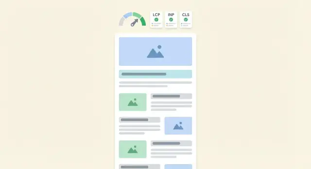
Core Web Vitals in plain language
Core Web Vitals are three signals Google uses to judge how a page feels to a real person. The basics are the same for any site, but long articles and lots of images make weak spots show up faster.
LCP: how fast the main content shows up
Largest Contentful Paint (LCP) is the moment the page feels like it has “arrived”. It measures when the biggest important thing in the first screen becomes visible. On content pages, that “big thing” is often a hero image, a featured image at the top, or even the first large paragraph block.
If the top image is heavy, LCP gets worse even if the rest of the page loads fine. That’s why image-heavy articles can feel slow even when the text appears quickly.
INP: why taps and scrolling feel laggy
Interaction to Next Paint (INP) is about responsiveness. When a reader taps a menu, opens a table of contents, expands a “read more”, or tries to scroll, the page should react right away.
INP usually gets worse because the browser is busy running too much JavaScript at once. Common culprits on articles are embeds, ad scripts, social widgets, and analytics that all compete for attention right after load.
CLS: why shifting feels broken
Cumulative Layout Shift (CLS) measures how much the page jumps around while loading. You feel it when you try to tap a link and it moves, or when paragraphs slide down because an image, embed, or font finally appears.
CLS is rarely about raw “speed”. It’s usually about missing space reservations. If the browser doesn’t know an image’s size, it can’t hold the right space, so everything below gets pushed.
On image-heavy articles, LCP often gets hit first (a large top image), and CLS is often what annoys readers most (content jumping). A quick gut-check is to reload your article on a phone and watch the first screen: if the main image pops in late, think LCP; if buttons and text move, think CLS; if the page stutters when you interact, think INP.
A practical example: if you publish a 2,500 word post with a big header image and several embeds, start by making that header image smaller and correctly sized, and reserve space for every image and embed.
Measure first so you don’t chase the wrong problem
Speed work goes wrong when you fix what you can see (often images) instead of what’s actually slowing the page down. Start by measuring the same way every time, then change one thing at a time.
Lab tests are best for debugging because they’re repeatable. Field data is best for judging results because it reflects real devices, real networks, and real user behavior. If lab looks great but field stays bad, you likely have a real-world bottleneck like slow third-party scripts, long main-thread tasks, or slow server responses.
Test different page types, because they fail in different ways. A single article might struggle with LCP from a hero image and CLS from ads or embeds. A category page often has many thumbnails and can suffer from too many requests. A home page might be dominated by fonts, sliders, and analytics.
Before you change anything, record a baseline so you can tell what helped:
- LCP, CLS, and INP for the page type you’re fixing
- Total page weight and number of requests
- Server response time (TTFB) and cache status
- Largest assets (often images, fonts, or video)
- Key scripts and their load order
When you review results, identify the main culprit instead of guessing. Here are quick tells:
- Images: the LCP element is an image, transfers are large, and the first screen renders slowly
- Fonts: text appears late, layout shifts when fonts swap, or there are many font files
- Scripts/embeds: long main-thread tasks, INP spikes after interactions, or late-loading widgets
- Server time: high TTFB even on simple pages, slow on first request but fast on repeat
A practical workflow is to pick one representative URL per template (one long article, one category page, one home page), capture the baseline, then re-test after each change. Keep templates stable during testing so you’re measuring performance changes, not layout changes.
Step by step: make images fast without looking worse
Images are usually the biggest bytes on a content page, so they’re often the fastest way to improve Core Web Vitals. The goal is simple: send the smallest file that still looks good, and only send it when the reader is likely to see it.
A workflow that works on most blogs
Separate your “editing master” from what you publish. Keep the original PNG/JPEG (or the camera file) in your library for future edits, but serve modern formats to readers. For most photos, WebP is a safe default, and AVIF can be even smaller if your pipeline supports it.
Next, fix the most common waste: oversized images. If an image shows at 800px wide in your article layout, don’t ship a 4000px photo. Resize exports to the largest size they’ll actually display, plus a little buffer for high-DPI screens.
Then compress on purpose, not by habit. Pick a quality target (for example, “looks clean at normal reading distance”) and compare before and after at 100% zoom on a typical laptop and a phone. This avoids two common traps: shipping huge files “just in case” or making everything look crunchy.
A simple checklist per image set:
- Export WebP/AVIF for delivery, keep originals elsewhere.
- Create a few widths (for example 480, 768, 1024, 1600) based on your design.
- Compress to a consistent visual quality, then spot-check.
- Use responsive markup so phones download smaller files.
- Lazy-load images that start below the fold, and only prioritize the top hero image.
Responsive images are where many sites win big. With srcset and sizes, a phone can grab a 480px file instead of a 1600px one, often cutting image bytes by half without any visible change.
Finally, be careful with “priority” and preloading. Preload only the hero image that affects LCP. If you preload several big images, you can slow down the one that matters.
If you publish at scale, automate this so every new article follows the same rules. Consistency beats one-off fixes.
Stop layout shifts that annoy readers
Cumulative Layout Shift (CLS) is the “page jumping” feeling when text moves while you’re reading. On content-heavy pages, it usually happens because something loads late and steals space that wasn’t reserved.
The fastest win is straightforward: reserve space for anything that isn’t instantly available. Images, videos, social embeds, ad slots, “related posts” blocks, and even cookie banners should arrive into a box that already has the right size.
Reserve space for media (images, embeds, video)
For images, include explicit dimensions so the browser can calculate layout before the file downloads. If you can, set width and height on the image element. If your layout is responsive, pair that with CSS that keeps the right shape.
.article img {
  width: 100%;
  height: auto;
  aspect-ratio: 16 / 9;
}
Do the same for embeds. A common CLS culprit is a social embed that starts small, then expands when the script loads. Wrap it in a container with a fixed height or an aspect-ratio so the article text doesn’t get pushed down.
Even when images are optimized, missing size hints still cause jumps. Make “dimensions required” a template rule, not an author preference.
Prevent late UI from pushing content
Another major cause is UI that appears after the page starts rendering: sticky headers, consent banners, newsletter popups, or a “recommended” module injected mid-article. Prefer overlays that don’t reflow the page, or allocate space up front.
A concrete example: a cookie banner that slides in and pushes the whole page down is almost guaranteed to hurt CLS. Instead, position it fixed at the bottom and add enough bottom padding to the body only once, before the user starts scrolling.
Font loading can also trigger reflow. Use a strategy that shows a fallback quickly and swaps in the custom font without changing metrics too much (variable fonts or metric-compatible fallbacks help). When possible, avoid multiple late-loading font files on the same article.
A quick CLS checklist:
- Every image and video has reserved space (dimensions or
aspect-ratio). - Embed containers have fixed sizing before scripts load.
- Ads and widgets use stable slots, not auto-expanding boxes.
- Sticky headers and banners don’t push content after first paint.
- Fonts swap without big text size changes.
Keep INP low on pages with lots of embeds and scripts
INP (Interaction to Next Paint) is about how quickly the page reacts when a reader taps something: a menu, a search box, a “load more” button, a video play button. On content-heavy pages, INP usually gets worse because too much JavaScript competes for the main thread at the same time.
Start by listing every third-party script on the page (analytics, ads, chat widgets, social embeds, A/B tools). Each one can add long tasks that block taps and scrolls, especially on mid-range phones. This is often the fastest win because you remove work rather than optimize around it.
A simple audit rule: if a script doesn’t help the reader in the first 10-15 seconds, it shouldn’t run during the first 10-15 seconds.
Practical ways to reduce interaction delays without breaking the page:
- Delay non-essential scripts until after the reader starts scrolling or after a short timeout.
- Defer JavaScript that isn’t needed for above-the-fold content.
- Remove duplicate trackers and features nobody uses anymore.
- Split big bundles so only the code for this page loads.
- Prefer CSS for simple effects (accordions, tabs) when possible.
Embeds are a common trap. A single social post or video embed can pull in large JS, fonts, and tracking before the reader even reaches it. A safer pattern is a lightweight preview: show an image thumbnail and a short caption, and only load the real embed when the reader taps it. The page stays responsive, and the reader still gets the content when they want it.
Example: you have a long article with three YouTube embeds, an Instagram post, a chat widget, and two analytics tags. Replace the embeds with click-to-load previews and delay chat until the reader has spent 30 seconds on the page. On a mid-range Android phone, taps on the table of contents and share button often feel instant again because the browser isn’t busy running third-party code.
If you publish via an API-driven setup, keep the page interactive by default and add scripts one by one, only where they earn their spot.
Delivery basics for long articles and many assets
A fast page isn’t just about what you build. It’s also about how your server delivers HTML, images, CSS, and JavaScript to the browser. Delivery mistakes can quietly cancel out otherwise good optimizations.
Cache and CDN: the easiest speed win
For static files (images, CSS, JS, fonts), you want two things: strong caching and a nearby copy. A CDN helps by serving files from locations close to your reader, and caching headers make repeat visits much faster.
A simple rule: if an asset rarely changes, cache it for a long time and change the filename when you update it (for example, include a version or hash). That way, browsers can safely reuse what they already downloaded.
A practical baseline:
- Put images, CSS, and JS behind a CDN and enable compression
- Use long cache lifetimes for versioned files so repeat visits are instant
- Pre-compress text files (HTML, CSS, JS) with gzip or brotli
- Serve modern image formats (WebP or AVIF) when possible
- Limit redirects, especially for images (each redirect adds delay)
Keep the HTML payload reasonable
Very long articles can produce very large HTML. Big HTML is slower to download, slower to parse, and can delay when the browser discovers important resources.
If your articles get huge, trim what loads on first view. A common approach is to load the article body first, and postpone heavy extras like related posts, large tables, comment widgets, and big embed blocks until the reader scrolls.
Reduce render-blocking CSS and extra styles
When CSS blocks rendering, your content waits. Start by removing unused CSS (themes and plugins often ship a lot). Then split critical and non-critical styles: keep only the small set needed for the top of the page, and load the rest later.
Also watch the number of separate CSS and JS files. Many small requests can be slower than a few well-packed ones, especially on mobile.
Server response time: what to check with your hosting
Even with a CDN, the first HTML still comes from your server. If it’s slow, everything starts late.
Check these basics before you chase tiny front-end tweaks:
- Time to first byte (TTFB) during peak traffic, not just off-hours
- Database or CMS delays (slow queries, too many plugins)
- Server caching (page cache, object cache) and whether it’s actually hit
- Image processing happening on request (resize on upload instead)
- CPU and memory limits that cause throttling under load
If you generate pages via an API or a headless setup, make sure the content endpoint is cached too. A fast template can still feel slow if every request waits on an uncached API response.
Example: fixing a long article with 30 images
Picture a 3,000 word guide with 30 photos, plus two embeds (say a video and a social post). On desktop it feels fine, but on mobile it loads slowly, jumps around, and the first scroll stutters.
What usually breaks first is the top of the page. The hero image becomes your LCP element, so if it’s huge or served in a heavy format, LCP slips fast. The second issue is layout shift: images without set dimensions, ad or embed placeholders that expand late, or fonts that swap after the page already rendered.
Fix order that tends to give quick wins:
- Fix the hero first: convert to a modern format, resize to the real display size, and preload only that one image. Expect LCP to drop noticeably.
- Add width and height (or an aspect ratio) for every image and embed container. Expect CLS to improve and the page to feel less jumpy.
- Lazy-load everything below the first screen, but keep the first 1-2 images eager. Expect faster initial load and less network competition.
- Replace heavy embeds with lightweight placeholders that load the real embed on tap or after the main content is stable. Expect better INP and smoother scrolling.
- Reduce extras on article pages: limit third-party widgets, and defer non-essential scripts. Expect fewer long tasks and fewer random slowdowns.
To confirm improvements, check mobile behavior, not just a fast desktop run. Use a mid-range phone, on mobile data, and test the same article several times.
Watch for three things:
- The hero: does it appear quickly, or does text render and then the image pops in late?
- Shifts: do headings, captions, or embed blocks move after you start reading?
- Interaction: do you feel hitching or delayed taps while the page is still loading?
If you generate lots of content, the biggest win is consistency. Apply the same image sizing, placeholders, and embed rules to every new article so you don’t re-fix the same problems each week.
Common mistakes that backfire
Most speed fixes fail for one reason: they make a tool score look better but make the page feel worse for real readers. On long articles with lots of images, small choices add up fast.
Common mistakes that cause regressions:
- Uploading one huge image and relying on the browser to scale it down. You still pay the download cost, and mobile users get hit the hardest.
- Lazy-loading the first big image on the page (often the hero). That image is usually your LCP element, so delaying it can make LCP worse.
- Not reserving space for images, ads, and embeds. When content jumps while a reader is trying to scroll, CLS spikes.
- Adding too many trackers and widgets on every page. Each script competes for CPU time and can increase INP, especially on lower-end phones.
- Optimizing only for a dev tool score and ignoring real user data. A clean lab test can hide issues that only show up on mobile networks or with third-party scripts.
A simple example: you publish a 2,500-word post and place a big featured image at the top. If that image is set to lazy-load, the browser waits until after layout and other work to fetch it. The page looks blank longer, and LCP gets worse. If you also forgot to set width and height (or an aspect ratio), the text may jump down when the image finally appears, causing a visible layout shift.
A safer pattern is to treat the top-of-page visual as special. Load it early, give it guaranteed space, and optimize it so it stays sharp without being heavy. Then apply lazy loading to images that are clearly below the fold.
Finally, be careful with “speed plugins” that inject lots of extra JavaScript. They may promise quick wins, but if they delay critical rendering or add more scripts, they can undo your efforts.
Quick checks and next steps
If you publish often, small performance slips add up. The easiest way to keep Core Web Vitals healthy is to turn the most common fixes into checks you do every time.
A short checklist that catches most issues before they go live:
- Identify the LCP element (usually the hero image) and make sure it’s properly sized, compressed, and not lazy-loaded.
- Confirm images have explicit width and height (or an aspect ratio) so the page doesn’t jump while loading.
- Preload only the one critical asset that truly affects above-the-fold loading (often the LCP image or a key font).
- Check caching headers for images, CSS, and JS so repeat visits are fast.
- Scroll the page and watch for CLS hotspots: late-loading embeds, ads, and “related posts” blocks that push text down.
To keep this practical, use a 15-minute audit routine whenever you introduce a new article template or a new content block:
- Open the page on mobile and watch the first 5 seconds: what appears late, and what shifts?
- Identify the single biggest element above the fold and confirm it loads early and stays stable.
- Toggle off non-essential embeds (video, social posts, widgets) and see if the page becomes noticeably calmer.
- Click a few interactive elements (accordion, comments, share buttons) and check for delay.
- Refresh once and then reload: if the second load isn’t much faster, caching or asset bloat is likely.
Standardizing your publishing workflow prevents the same problems from returning. Set simple rules like: every image must have fixed dimensions, only one heavy embed per page unless there’s a strong reason, and no auto-inserting blocks above the fold after the page starts rendering.
If you want to make this repeatable at scale, tools like GENERATED (generated.app) can help by generating and polishing content, producing consistent image variants, and serving content via API so your templates can stay predictable as volume grows.
FAQ
What usually makes a content-heavy page feel slow to readers?
Start with the element that dominates the first screen, usually the hero image or the first big text block. If that asset is large, late, or blocked by other downloads, the page feels slow even if the rest is fine.
What is LCP in plain terms, and why do blog posts struggle with it?
LCP is when the main above-the-fold content becomes visible and the page feels like it has “arrived.” On articles, LCP is often the featured/hero image, so optimizing and loading that one image early is a common quick win.
Why does my article jump around while loading (CLS), and how do I stop it?
CLS is the amount the page shifts while loading, like when text moves after an image or embed finally appears. Reserve space for images, ads, and embeds so the browser can lay out the page before those assets load.
Why do taps and scrolling feel laggy on long posts (INP)?
INP measures how quickly the page responds after a tap or scroll. It often gets worse because too much JavaScript runs at once, especially from embeds, ads, social widgets, and multiple analytics tags.
Should I rely on lab tests or real-user data to judge improvements?
Use lab tests to debug because they’re repeatable, then use field data to confirm real users improved. If lab looks good but field is still bad, the bottleneck is often real-world issues like third-party scripts, slow server response, or weaker phones.
How do I know what image sizes to generate for responsive images?
Export a few practical sizes that match your layout (for example 480, 768, 1024, 1600) and use responsive image markup so the browser picks the right one. The goal is to avoid shipping a giant image to a small phone screen.
Which images should be lazy-loaded, and which should not?
Lazy-load images that are clearly below the fold, but do not lazy-load the hero/featured image that affects LCP. A common pattern is to load the first 1–2 images normally and lazy-load the rest.
Should I preload images or fonts on article pages?
Preload only the single asset that truly determines the first-screen experience, often the LCP hero image (or occasionally a key font). Preloading multiple large images can slow down the one that matters by competing for bandwidth.
What are the fastest fixes to reduce CLS on image- and embed-heavy pages?
Give every image explicit dimensions or an aspect-ratio, and wrap embeds in containers with stable sizing before scripts load. Also avoid UI that pushes content down after render, like banners or headers that insert late into the layout.
How can I keep INP low if I need embeds, ads, and analytics?
Replace heavy embeds with lightweight previews that load the real embed only on tap, and delay non-essential third-party scripts until after the reader starts scrolling or after a short timeout. Reducing early JavaScript work is often the quickest way to make interaction feel instant again.