Blog design system: components and templates that stay fast
Build a blog design system with reusable components and templates for headings, callouts, tables, and CTAs that stay fast and consistent.
Why blog pages get inconsistent and slow
Most blogs start out tidy, then drift. One post has a slightly tighter line height. Another uses a different quote style. A third adds a custom table with odd borders because it “looked better this time.” After a few months, the blog design system stops being a system and turns into a pile of exceptions.
You see the inconsistency in the basics: spacing between sections, heading sizes, how lists wrap on mobile, and whether callouts read like helpful notes or random colored boxes. These small differences stack up. Readers might not name the problem, but they feel it. The page looks less trustworthy, and it takes more effort to scan.
One-off layouts also slow down your team. Writers hesitate because they’re unsure which pattern to use. Editors spend time fixing formatting instead of improving the message. Developers get pulled in for “tiny tweaks” that aren’t tiny once they need to be reused.
The breakpoints are usually predictable: headings that jump in size, tables that overflow on mobile, callouts that compete with the main text, and CTAs that show up at random moments in mixed tones and styles.
A simple example: publish five posts over two weeks, each with a different CTA block. Now analytics can’t compare performance cleanly, and updating the CTA later means touching five different layouts. Consistency keeps pages fast to build and fast to read.
Principles to set before you build components
A blog design system works when everyone can remember the rules. If the rules are fuzzy, people improvise, and pages slowly drift into a mix of styles, sizes, and one-off fixes.
Start with a small set of goals that cover both readers and the site:
- Consistency: the same patterns look and behave the same everywhere.
- Readability: text is easy to scan on mobile and desktop.
- Speed: pages load quickly on real devices.
- Accessibility: content works with keyboard navigation and screen readers.
Next, decide what must be standardized and what can vary. Standardize things that affect comprehension and trust: heading levels, paragraph width, table styling, callout types, and CTA placement rules. Allow variation where it adds meaning: a post can choose which callout type to use, or whether it needs a table at all, but it shouldn’t invent new colors or spacing.
Lock a few design rules early: one typography scale (H2-H4, body, captions), a spacing scale (section gaps, callouts, table padding), and a small color set (text, background, borders, status colors). Keep it boring on purpose. The blog should feel calm.
Agree on a performance budget before anyone ships components. Keep it measurable: how many web fonts and weights, image width and file size targets, a typical page weight, and hard limits on third-party scripts. If you publish through generators or an API, these budgets matter even more because small layout choices multiply across every page.
Define the anatomy of a blog post
A design system starts with a shared map. If everyone agrees what a “normal” post looks like, you can build components that are reusable, predictable, and easy to keep fast.
Name the default structure and what’s optional. A common baseline is: title, a short intro (often called a dek), author and date, body content, an optional sidebar (only if it has a clear job), and a footer area for related posts or a signup.
Heading rules that prevent chaos
Headings are often the first place consistency breaks. Decide what each level means, not just how it looks.
Use H2 for the main sections a reader would scan in a table of contents. Use H3 only inside an H2, when you truly need sub-steps or a clear split. If you find yourself writing three H3s in a row, it’s usually a sign the H2 should be rewritten or split into two clearer H2 sections.
Common content patterns to standardize
Most posts repeat the same patterns. When you define them once, writers and editors stop reinventing formatting.
Standardize a handful of patterns that show up constantly: short callouts for tips and warnings, clear step-by-step instructions (one action per step), small comparison tables with consistent labels, and simple definitions (one sentence, optionally followed by a quick example).
Decide where CTA blocks can appear without feeling pushy. A practical rule is one mid-article CTA after a genuinely helpful section (not after the intro), plus one end-of-article CTA that matches the post’s promise.
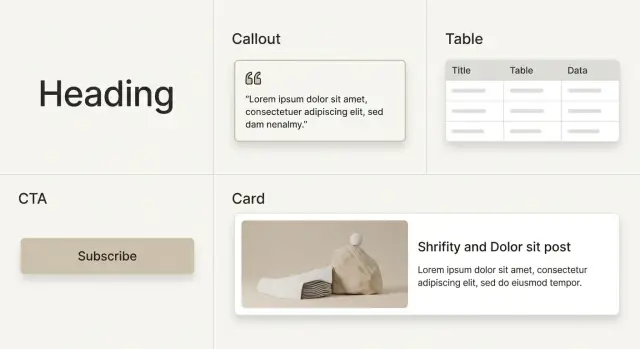
Core components: headings, callouts, tables, and CTAs
A blog design system lives or dies on a small set of components that appear in almost every post. If these are consistent, the whole page feels consistent, even as writers change.
Headings that stay readable (and linkable)
Treat headings as navigation, not decoration. Use a consistent spacing scale (more space above than below) and keep it the same across templates. If you add anchor links to headings, keep the icon subtle and show it only on hover or focus.
On mobile, avoid huge jumps in font size. Cap the max width of the content column so headings don’t wrap into four or five lines.
Callouts that clarify instead of compete
Callouts should communicate meaning at a glance. Use a small set of clear types (Info, Warning, Success, Note) with one icon style, one border style, and consistent padding. Keep them short and avoid cramming multiple ideas into one box.
Tables that don’t break on mobile
Tables are where consistency often falls apart, so define the behavior before you ship it:
- Use horizontal scroll on small screens, with a visible edge cue.
- Keep row stripes subtle and readable.
- Let long text wrap and cap the widest column.
- Right-align numbers and left-align text.
- If you use captions, keep style and placement consistent.
CTAs with clear hierarchy
CTAs need structure so they don’t feel like ads. Standardize a few variants and use them intentionally: an inline CTA (in the flow), an end-of-post CTA (the default), and a banner CTA (rare, only when it truly fits).
Keep the layout fixed (for example: title, one short paragraph, then one primary action) and let the wording vary. This is also where tools that generate content at scale can help without changing your design. For example, GENERATED (generated.app) is an all-in-one SaaS that can generate content via API and produce adaptive CTA copy with performance tracking, which is easier to manage when your CTA block layout is already standardized.
Finally, keep a small set of utility components: dividers, captions, pull quotes, and code blocks. Use them sparingly, but make them predictable so authors can build pages without inventing new UI.
Templates that keep every post on rails
A blog design system pays off when writers stop making layout choices from scratch. Templates turn a blank page into a predictable structure that’s easy to scan, easy to build, and harder to break.
Start with a small set of templates that match your common post types:
- Standard post (opinion, roundup, trends)
- Comparison post (A vs B, alternatives)
- Tutorial (step-by-step with checkpoints)
- Announcement (release notes, new feature)
For each template, document what components are allowed and where they can appear. For example, a Tutorial template might allow step callouts, “common mistake” callouts, and one summary table, while limiting CTAs to two placements.
Plan for empty states so posts never look broken when something is missing. If there’s no hero image, use a clean title block with a subtle divider and keep the first paragraph visible above the fold. If there’s no table, don’t leave an awkward gap. Use a short list or a callout instead. If there’s no CTA, only show a neutral “related actions” slot when it has real content.
Responsive rules should be part of the template, not a last-minute fix. Decide up front what stacks, what collapses, and what scrolls on small screens. Keep the rules simple: tables scroll horizontally with an edge hint, multi-column callouts stack into one column, and CTAs sit after the first substantial section and near the end.
If you generate posts via an API, treat templates as strict schemas so every page ships with the same safe defaults and fallbacks.
Step by step: building and rolling out the system
Start with what you already have. Inventory a set of recent and top-traffic posts. You’ll quickly see the real variety: how many heading styles exist, how many callout types, how tables are used, and where CTAs appear. You’re not aiming for perfection yet. You’re looking for a few repeatable patterns.
Design components before templates. Components are the building blocks (heading styles, callouts, tables, CTA blocks). Templates are the rails that arrange them. If you begin with templates first, you often bake in exceptions that later slow you down.
A rollout path that won’t stall publishing:
- Audit existing posts and group them into a few common layouts.
- Build the smallest set of components that can recreate one high-performing post without hacks.
- Retrofit templates around real content and edge cases (long headings, wide tables, short posts).
- Write simple content rules: when to use each callout, which CTA block fits which intent, and what to avoid.
- Roll out in phases: new posts first, then refresh the highest-traffic pages, then the long tail.
Content rules matter more than most teams expect. A callout is only useful if everyone uses it the same way. The same goes for CTAs: decide where a “try it now” CTA is allowed versus a “subscribe” CTA, so posts don’t become a random mix.
Keep the first release small and measurable. If your stack supports it, track CTA blocks in a consistent way so you can compare performance over time instead of debating taste.
Keeping pages fast while staying consistent
Speed is a design feature. A good blog design system keeps the same look across posts without adding new CSS, scripts, or one-off tweaks every time someone publishes.
Keep your CSS small and predictable. If every post needs custom styling, you end up shipping overrides that fight each other. Prefer a short set of tokens (spacing, colors, type sizes) and a small number of component variants, then remove anything you don’t use.
Tables are a common slowdown and a common readability problem. Make them simple: fewer borders, more whitespace, clear row spacing. On mobile, don’t force tables to wrap into unreadable stacks. A horizontal scroll container is often faster and easier than complex responsive table logic.
Images quietly become your biggest payload. Use consistent aspect ratios so layouts don’t jump during load, set standard display sizes per template, and define compression targets (max widths per layout and file size budgets). If your workflow produces images automatically, lock those presets into the template so every post follows the same rules.
Fonts and scripts need the same discipline. Each new font weight or third-party script adds latency. Measure before and after changes, and remove additions that don’t earn their keep.
A short checklist that protects both speed and consistency:
- No per-post CSS, only approved component variants.
- One table style with mobile scroll behavior.
- Standard image ratios and export sizes, with compression targets.
- Minimal font weights and only necessary scripts.
Governance: how to keep the system from drifting
A design system stays useful only if people can trust it. Without light governance, variants pile up, spacing drifts, and one-off “special” blocks return. Pages become harder to edit and slower to load.
Start with naming that reads like plain English. If a new writer can guess what a component does, you’re already winning. Keep names consistent across design and code, and keep variants few.
A simple naming pattern that avoids confusion:
- Component name: what it is (Callout, Table, CTA)
- Variant: what it’s for (Note, Warning, Comparison)
- Tone or size (only when it changes meaning): Short, Long
Writers and editors need usage rules, not just a library. Add a short “good vs bad” guide for each component and call out common misuses, like stacking callouts, putting CTAs mid-table, or skipping heading levels.
Give editors a two-minute checklist:
- Headings follow order (no jumping from H2 to H4).
- Tables are readable on mobile (few columns, clear labels).
- CTAs are limited and placed intentionally.
- Callouts are used for exceptions, not main text.
Treat changes like product releases. Version components so old posts keep rendering the same, limit breaking changes, and make it clear who can approve new components. A default “no” is healthy unless the request solves a repeating problem.
A realistic example: standardizing an existing blog
Picture a growing SaaS blog with about 300 posts, six writers, and a few people who edit when they have time. It started simple, then slowly turned into a mix of styles: different heading sizes, random callouts, and tables that break on mobile.
Analytics show a pattern. Posts with comparison tables have higher bounce. Readers scroll past the middle, then leave. On top of that, every post ends with a different CTA: different copy, different button style, sometimes three CTAs stacked, sometimes none.
The team starts small instead of rebuilding everything at once. One template becomes the default for new posts, and only three components get standardized first: a responsive table, a single CTA block, and one callout style for tips and warnings. Headings keep basic rules: H2 for sections, H3 for subsections.
They migrate ten high-traffic posts first, the ones that already rank and get steady clicks. After publishing, they compare a few clear signals over two weeks: bounce rate on posts with tables, scroll depth to the CTA, CTA click rate, and time on page.
To avoid confusion, they keep a tiny change log in the writing guidelines: what changed, what to use now, and what’s deprecated.
Common mistakes and traps to avoid
The fastest way to break a blog design system is to treat every new request as a new component. You end up with five callout styles, three button shapes, and a dozen “special” layouts. Editors then pick at random, and consistency disappears.
A useful rule: add a variant only when the content meaning changes. If two callouts cover “tip” and “warning,” you probably don’t need “note,” “insight,” and “extra” as separate styles.
Another trap is mixing content and presentation. When writers paste hardcoded colors, font sizes, or spacing, the post looks right today but becomes painful to fix later. Keep the content clean (text, meaning, intent), and let the component decide how it looks.
Headings get abused too. If someone uses an H2 because it “looks bigger,” you lose structure, accessibility, and table-of-contents accuracy. Pick heading levels based on the outline, then style them in the component layer.
CTAs can backfire when they’re everywhere. When every section ends with a CTA, readers learn to skip them. Put CTAs where intent is highest: after a key benefit, after a comparison table, or at the end.
Mobile tables are a quiet UX killer. They often get ignored until complaints roll in.
Quick sanity check before publishing:
- Can you remove two component variants without changing meaning?
- Are headings used for structure, not size?
- Are CTAs limited to one or two with a clear purpose?
- Do tables scroll cleanly on a phone?
- Is content free of hardcoded styles?
Quick checks before you ship
Before you publish (or migrate) a batch of posts, do a fast pass on consistency and speed. A good blog design system should feel invisible to the reader: everything looks intentional, nothing gets in the way.
Consistency checklist
Skim one post from each author or content type and check a few basics:
- Headings follow one scale and spacing looks consistent from post to post.
- Callouts have a clear reason (warning, tip, example) and match that tone.
- CTA blocks appear only where they help, and aren’t repeated over and over.
- Tables stay readable on a phone, with obvious horizontal scroll when needed.
- Images follow size rules and don’t shift the layout while loading.
Then do a quick feel test as a reader. Open a post on mobile, scroll top to bottom, and watch for surprises: a random heading size, a callout that looks like an ad, or a table that turns into a tiny wall of text.
Speed sanity checks
Pick one post with tables and multiple images. If it feels slow, heavy media is usually the cause. Use a single hero image size, keep thumbnails consistent, and avoid inserting large images where a smaller one would do. If you generate images, set strict output sizes so every image is ready to serve without extra work at page load.
Next steps: iterate, measure, and scale content production
Start small so you can learn quickly. Inventory what you already have (heading styles, callouts, tables, CTA blocks), then choose one first release that touches real posts: a single template plus a few core components. Adoption happens when the system makes publishing easier right away.
Before changing anything, decide what “better” means. For most blogs, it’s a mix of reading comfort and results: time on page, scroll depth, CTA clicks, and sign-ups. If you rely only on opinions, you’ll keep redesigning the same pieces.
A simple iteration loop:
- Ship a template update to a small set of posts.
- Measure a week or two of behavior (scroll, clicks, conversions).
- Keep what helps and revert what hurts.
- Write down the rule so it becomes the new default.
If you publish at scale, consistency is hard to maintain by hand. Two areas are worth automating early: CTAs that match the post’s intent, and images that fit the same layout and file rules across posts.
If that kind of workflow is already on your roadmap, GENERATED on generated.app is one option to support it: it can generate SEO-focused content via API, produce blog images, and generate aligned CTAs with tracking, which fits best when your templates and component rules are already defined.
Pick one realistic milestone: “Every new post uses the template, and every CTA is one of our approved blocks.” Once that’s stable, expand to older posts in batches and keep measuring as you go.
FAQ
Why do blog pages become inconsistent over time?
Blog pages drift because people solve one-off problems under time pressure. Small changes to spacing, headings, callouts, tables, and CTAs accumulate until the “default” isn’t clear anymore, so every new post becomes a new layout decision.
What should I standardize first in a blog design system?
Start by standardizing the parts that affect reading and trust: typography scale, spacing scale, a small color set, and a few core components like callouts, tables, and CTAs. Leave content choices flexible, but don’t allow new styling rules per post.
How do I stop heading levels from turning into chaos?
Use headings for structure, not for visual size. A simple rule is H2 for main sections and H3 only inside an H2 when you truly need sub-points, and never skip levels just to get a bigger font.
What’s the best way to handle tables on mobile?
Make one table component with a clear mobile behavior and never deviate from it. The most reliable default is a horizontal scroll container on small screens, with wrapping text and predictable alignment so the table stays readable.
How many callout styles should we allow?
Use a small set of callout types that signal meaning at a glance, then keep styling consistent. Callouts work best when they’re short and rare, and when they highlight exceptions rather than replacing the main content.
Where should CTAs go so they don’t feel spammy?
Default to two CTA placements: one after a genuinely helpful section and one at the end of the post. Keep the CTA layout consistent and vary only the copy, so performance is comparable and updates don’t require redesigning each post.
What is a performance budget for a blog, and what should it include?
Set measurable limits early, like font count, image size targets, and a cap on third-party scripts. Performance budgets work best when they’re enforced through templates and components, so new posts don’t quietly add extra weight.
What’s the difference between components and templates, and which should we build first?
Components are the reusable building blocks, while templates are the approved ways to arrange them for common post types. Build components first so you aren’t forced to create exceptions, then create a small set of templates that cover most posts.
How do we roll out a design system without pausing publishing?
Audit a handful of recent and high-traffic posts to find the patterns you already use. Standardize the smallest set of components that can recreate a top post cleanly, ship it for new posts first, then migrate older posts in batches.
How do we keep the system from drifting again after launch?
Keep the rules easy to remember and add lightweight checks for writers and editors. Version components, limit who can approve new variants, and treat “no” as the default unless a change solves a repeating problem across many posts.