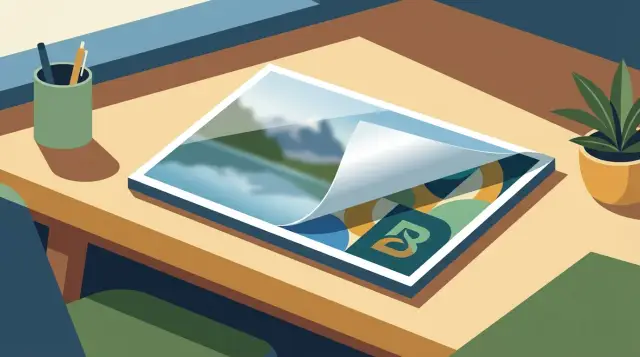
Avoid stock-photo sameness with AI images for SEO covers
Learn prompt patterns and art direction to avoid stock-photo sameness with AI images while keeping featured images consistent, readable, and SEO-friendly.
What stock-photo sameness looks like (and why it happens)
Stock-photo sameness is that familiar cover-image feeling where every post looks like it came from the same template. Think smiling people in perfect lighting, generic office desks, floating icons, or a shiny 3D object on a smooth gradient. You scroll a feed of social cards and nothing sticks because everything feels safe, polished, and interchangeable.
With AI, this happens fast. Many prompts accidentally ask for the most average version of an idea: “professional,” “clean,” “modern,” “photorealistic,” “studio lighting.” Models learned those patterns from a huge amount of commercial imagery, so they drift toward the glossy, ad-like look even when your topic is specific.
A few common tells:
- Over-perfect faces, hands, and props that feel staged
- Blue/teal gradients with soft glow and bokeh
- Random tech icons, charts, or “innovation” shapes with no meaning
- Symmetrical center framing with too much empty polish
- No specific place, tool, or story detail
“Distinct” doesn’t mean noisy or weird. It means the image communicates one clear idea with one memorable twist, while staying calm enough to sit behind a headline and still read as a thumbnail. Instead of “AI generating content,” show a simple metaphor like a labeled folder stamp that says “draft” on textured paper, in your brand colors.
SEO and brand consistency can coexist. SEO wants relevance and clarity, not visual blandness. If you can describe the image in one plain sentence and it matches the post topic, you’re already doing the SEO part. Brand consistency comes from repeating a few controlled choices (palette, framing, texture, illustration style), not from repeating the same stock scene.
If you use a generator such as GENERATED, the goal is to guide it away from defaults with clear constraints so each cover is recognizable as yours, not the internet’s average idea of “professional.”
Set a simple art direction before writing prompts
To avoid stock-photo sameness, start with a tiny art direction, not a bigger prompt. Three clear rules give the model something to repeat, and they give your blog a consistent look.
Pick 2 to 3 visual rules you can reuse across posts, and make sure they’re visible at thumbnail size. A limited palette (ink black + one accent color), one repeatable texture (paper grain or halftone dots), and a framing habit (one main object with generous negative space) go a long way.
Choose an image “voice” and stick to it for a while. Mixing photoreal, 3D, and illustration from post to post is one of the fastest ways to end up looking generic. A single voice makes even simple topics feel like they belong together.
It also helps to keep a short do-not-use list to block the usual shortcuts: perfect smiles, handshake shots, floating hologram UI, glossy office desks, random city skylines, and faceless hoodie figures. When you ban the cliches, you force more original choices.
A practical starter kit:
- Color rule: 2 neutrals + 1 accent color, no gradients
- Texture rule: subtle paper grain, slightly imperfect edges
- Subject rule: one symbolic object, no people
- Framing rule: wide margins for title text
- Cliche bans: handshakes, laptops-on-table, neon “AI brain” icons
Collect a small reference set you want to resemble in spirit, not copy. Think “editorial collage with bold cutouts” or “minimal product still life.” When you prompt, describe those traits, not a specific artist or a specific image.
Prompt patterns that consistently produce distinct images
Stop starting with a vague noun (like “business meeting”) and start with a repeatable prompt structure. A simple template forces real choices, and real choices are what make a cover memorable.
Use a fixed prompt skeleton
Use this order: subject + setting + material + lighting + lens. Then add one brand constraint.
Template:
“[Subject] in/at [setting], made of [material], shot in [lighting], with a [lens/camera feel]. Brand constraint: [limited palette or recurring motif].”
A concrete version:
“A small origami lighthouse on a messy writer’s desk, made of recycled newspaper and matte ink, shot in soft morning window light, 50mm lens look, shallow depth of field. Brand constraint: cream background with one accent color (deep teal).”
Add 1-2 uncommon specifics (but keep them believable)
Generic images are usually missing specificity. Pick details that feel physical: a location that isn’t overused, a surprising material, or a prop with texture. One or two is enough. Too many details make the image noisy and hurt readability at thumbnail size.
A recurring motif becomes “yours” over time: a paper cutout style, a tiny geometric badge in the corner, or a strict two-color palette.
Before generating, include a short “do not” line to block stock defaults:
- no stock photo, no corporate office, no smiling models
- no glossy 3D render, no plastic skin, no fake bokeh circles
- no generic icons, no random text, no watermark
- no oversaturated colors, no ultra sharp HDR
If your tool supports presets (including platforms like GENERATED), save this skeleton once, then only swap the subject and the uncommon specifics per post.
Composition rules for featured images that don’t feel generic
A featured image gets judged in a split second, usually as a small thumbnail next to other posts. If it doesn’t have a clear focal point, it turns into visual noise and starts to resemble stock.
Decide what the viewer should notice first, then commit to it. Pick one main subject and make it larger than you think. A single, obvious subject reads better at small sizes than a busy scene where objects compete.
Asymmetry helps you avoid the template look. Centered subjects with perfectly balanced lighting often feel like catalog photography. Try placing the subject on the left or right third, angling it slightly, or cropping it so it feels candid but still intentional.
Keep the background calm on purpose. If your blog layout overlays the title on the image, you need predictable contrast. Ask for a simple backdrop, limited shapes, or a subtle gradient so the headline stays readable without adding text inside the image.
A few composition patterns that tend to work:
- One hero subject with a smaller supporting element
- Rule-of-thirds placement, leaving one side visually quiet
- One strong shadow direction for depth without clutter
- Intentional crop (half-frame subject) to feel editorial, not posed
Before you generate, define “safe space” for your title and UI. If your site puts the headline at the top-left, reserve that corner by keeping it low-detail and mid-tone, and push the subject to the opposite side.
A quick check: a post about “email marketing tips” often becomes a laptop centered on a desk. A more distinct cover is a close-up of a single paper envelope icon treated like a physical object, placed off-center, with a calm area reserved for the headline.
Style choices that create a recognizable look across posts
A recognizable look is less about finding one perfect “brand style” and more about repeating a few decisions on purpose. If every post gets a different aesthetic (photoreal one day, 3D the next, watercolor after that), your feed starts to look like a stock library.
One practical approach is to assign one style family to each content category. Readers start to feel the difference between a how-to and a glossary page without seeing the title.
For example:
- How-to: clean still life with one hero object
- News: editorial illustration with flat shapes
- Glossary: simple 3D icons on a plain background
- Case study: abstract data shapes with one “real” element
- Opinion: hand-drawn ink or pencil with visible texture
Keep lighting consistent inside each family. Pick one (soft window light, hard flash, or controlled studio light) and keep it stable. When lighting stays consistent, even different topics feel related.
Textures help AI images feel designed, not random. Choose a small set and reuse them like a wardrobe: paper grain, matte clay, frosted glass, ink bleed, woven fabric.
Watch out for overused motifs: handshake silhouettes, glowing brains, generic laptops, anonymous business people. Replace them with topic-specific metaphors. A post about “site indexing” can be a tidy library card catalog drawer with labeled tabs, instead of a magnifying glass on a keyboard.
If you generate images through a tool like GENERATED, keep the same style constants every time (lighting, texture, background simplicity) and swap only the metaphor object. That one habit creates a visual system readers recognize.
Make images work with real layouts and crops
Your image isn’t just an image. It’s a thumbnail on mobile, a wide card on desktop, and a cropped preview in social shares. Art-direct for those crops first, then prompt.
Pick one default aspect ratio for your site and stick to it. A common choice is 16:9 for blog covers, plus a social preview version (often close to 1.91:1). Consistency makes your posts feel like a series, not a pile of unrelated pictures.
Cropping breaks many otherwise good AI images. Keep the subject in a safe central area and keep the edges boring. Tiny hands, faces, or text near the borders are the first things to get cut off.
A simple safe-layout rule:
- Keep the focal point in the middle 60 percent of the frame
- Leave one clean corner for titles or labels (if you overlay text)
- Avoid thin objects that touch the frame edges
- Use larger, simpler shapes that survive small thumbnails
Plan resizing before you generate. If you know you’ll need square crops for feeds, ask for a wider scene with extra negative space on the sides so you can crop to 1:1 without losing the main idea.
Photoreal vs illustration is also a layout decision. Photoreal images can build trust for practical topics (pricing, how-to), but they often look generic. Illustration is usually clearer at small sizes and avoids uncanny faces. A post about “keyword research” may work better as a simple illustrated desk scene with one bold object than a realistic person staring at a laptop.
If your workflow includes tools like GENERATED on generated.app, use the built-in resizing and polishing to output the exact sizes you need. Still check the final crop in your real page header and social preview frames before publishing.
SEO best practices for AI featured images (without getting generic)
Treat the image like part of the page, not decoration. The fastest way to look generic is to generate something “nice” that doesn’t clearly match what the post is about.
Start with clarity and relevance. If the post is about prompt patterns, show a simple visual metaphor for pattern building (cards, tiles, stitched paper, grid lines), not a random person holding a laptop.
A few choices that reliably help:
- Use a descriptive filename that reads like a label (for example:
ai-image-prompt-patterns-featured.png, notcover-final-3.png). - Write alt text that describes what’s visible and why it matters, without keyword stuffing (example: “Abstract grid of prompt cards forming a speech bubble, representing reusable AI prompt patterns”).
- Design for the thumbnail first: one clear subject, big shapes, and empty space where your title may sit.
- Export a clean, web-friendly file so the page stays fast.
Tiny details are where AI covers often fail in practice because they blur in previews. Skip small text inside the image, busy collages, and intricate backgrounds. If you need “detail,” use texture (paper grain, soft noise, simple linework) instead of adding more objects.
For performance, resize to the real display size (or a sensible max), then compress. If your generator supports it, run a quick polish pass after generation to remove artifacts and keep edges crisp. Tools like GENERATED can handle generation plus resizing and polishing so you don’t ship a heavy file by accident.
A concrete example: for a post on “SEO featured image best practices,” generate a clean desk scene but swap the cliche for a distinct prop set, like a single bold checklist card on a textured background with a strong brand color block. It reads instantly, stays sharp when cropped, and still matches the topic.
A step-by-step workflow you can reuse every time
Consistency beats “perfect prompts.” A small, repeatable workflow keeps covers clear and SEO-friendly without sliding back into stock.
1) Start with a one-sentence visual brief
Before you write any prompt, write one sentence that captures the article angle and what the reader should feel. Example: “A calm, practical cover that shows a real desk moment, not a fake corporate handshake.” This prevents generic filler.
2) Use a template, then add two specifics
Keep one prompt template for your site (subject + setting + camera + style). Then add exactly two unique specifics tied to the post: a concrete prop and a concrete constraint. For example, “folded paper checklist with three boxes ticked” and “space on the left for a headline.” Those two details usually beat a long list of adjectives.
3) Generate a batch, then judge like a thumbnail
Generate 6 to 12 variations in one batch. Pick winners by how they read at small size and how well they fit your layout, not by tiny details.
Selection filter:
- Clear subject in the first second
- Strong contrast between subject and background
- No awkward hands, faces, or unreadable text
- One obvious focal point, not a busy collage
- Works in your most common crop (often 16:9)
4) Iterate one variable at a time
When you refine, change only one thing per round: lighting, color palette, camera angle, or a single prop. If you change five things at once, you won’t learn what actually improved the image.
5) Resize, polish, and re-check crops
Export to your real featured-image sizes, then check center, edges, and contrast again. If you use a tool like GENERATED on generated.app, do the resizing and polishing after you’ve locked the composition so the final image stays crisp in real page layouts.
Example: turning a cliche topic into a distinct featured image
A “budgeting” post is where stock-photo sameness shows up fast. You type “budgeting” and get piggy banks, stacks of coins, and a smiling couple at a kitchen table. It signals the topic, but it also looks like everyone else.
Swap the subject, not the meaning. Keep the headline’s promise (control, clarity, trade-offs), but choose a metaphor that feels more specific: “budgeting is choosing lanes” (constraints), “budgeting is labeling jars” (allocation), or “budgeting is a weekly map” (planning).
Three prompt patterns that stay on-topic while changing the vibe:
Featured image, editorial illustration, metaphor for personal budgeting: a tidy pegboard with labeled tags (rent, food, savings, fun) and a few empty hooks showing trade-offs, warm limited palette (cream, charcoal, muted teal), simple shapes, subtle paper texture, no people, no currency symbols, plenty of negative space for headline, high contrast, 16:9
This reads as “allocation” without coins. The empty hooks add story (you can’t fund everything) and it still fits SEO featured image best practices because the idea is clear at a glance.
Minimal still life photo, metaphor for budgeting: a weekly planner page with color blocks and checkmarks, a single pencil, soft side light, neutral background, shallow depth of field, no hands, no piggy bank, no cash, clean composition with room for text, 16:9
This keeps a realistic feel, but avoids the usual props. It also crops well because the hero object (planner) can sit off-center.
Flat vector design, metaphor for budgeting: a simple subway map where each line is a spending category, one station highlighted as “savings”, restrained brand-like colors, bold lines, no icons of money, modern and clean, large empty area for title, 16:9
This one feels more designed and can become a recognizable series style across posts.
To keep it on-topic, anchor the prompt with one concrete budgeting cue (category labels, weekly planner, trade-off marker) and remove the cliche props (piggy bank, cash, coins). The goal is instant meaning plus a fresh visual hook.
Common mistakes that cause the stock-photo look
The stock-photo vibe shows up when your prompt gives the model permission to choose the safest, most average version of the idea.
One common trap is asking for “professional, high quality, realistic.” Those words are so broad that the model reaches for its most familiar recipe: glossy lighting, perfect symmetry, and bland subjects. Instead, describe what makes the scene specific (materials, setting, camera distance, mood) and what to avoid.
Another mistake is stuffing the prompt with too many styles at once. “Watercolor + 3D + cinematic + minimal + futuristic” often turns into visual noise and the result looks like a template. Pick one clear style direction and one clear subject, then add only a couple constraints (background simplicity and a limited palette).
Faces and generic office scenes are the fastest route to sameness. Smiling people in headsets, handshakes, open-plan desks, and floating hologram charts all blur together. If you need a human element, try hands, silhouettes, or an implied presence (a jacket on a chair, a notebook, a cup) paired with a strong object metaphor.
Thumbnail readability gets ignored. If the image only works at full size, it will look like every other cover once it’s cropped and reduced. Decide what must remain clear at small size: one main shape, high contrast, and enough empty space for a headline.
Finally, don’t let the generator add text, logos, or UI elements you can’t legally or practically use. AI text is often garbled, and fake interface details can mislead readers. A simple rule helps: ask for “no text, no logos, no watermarks, no interface screens,” and keep the concept strong enough that it doesn’t need labels.
If you’re generating images at scale (for example, via a tool like GENERATED that can produce and resize blog images), these mistakes repeat quickly. Tight prompts and a consistent art direction prevent a whole feed of different topics from looking like the same generic cover.
Quick checklist before you publish
Most featured images look fine at full size, then fall apart in a feed, a card, or a mobile crop. A fast “real world” review keeps you from drifting back into generic visuals.
Check the places people will actually see it: your blog list view, the post header, and a social preview crop. If your CMS allows it, preview against both light and dark backgrounds.
Quick pass:
- Shrink it to thumbnail size. Can you still tell what the main subject is in one second?
- Hide the headline text and ask: would a stranger guess the topic from the picture alone?
- Compare it to your last 5 posts. Does it fit your palette and style family (lighting, texture, level of detail)?
- Test crops: wide (blog header), square (social), and tall (mobile). Make sure nothing important gets cut.
- Export a compressed version and zoom in. Look for muddy gradients, weird halos, or crispy edges.
If one item fails, fix it with a small change, not a full restart: adjust framing, simplify the background, increase subject contrast, or regenerate a tighter variation. If you use generated.app, the resizing and polishing step can help keep details clean across formats without changing your core art direction.
Next steps: build a repeatable system for distinct images
Treat image making like a small product, not a one-off task. The goal is simple: make your good taste reusable.
Create a one-page image style spec based on your best-performing visuals. Keep it practical: 2 to 3 colors you lean on, how much empty space you want for headlines, your typical camera angle (top-down, straight-on, wide), and 1 to 2 signature details (grain, paper texture, bold outline, geometric shapes). Use it as a decision filter when prompts drift.
Save a handful of proven prompt templates for the types of posts you publish most. You don’t need dozens. Three to five templates per content type is usually enough, as long as each includes your style anchors (composition, palette, and one repeatable motif).
Then lock in a routine you can run every time: generate a small batch, select with the real crop in mind, resize to your standard dimensions, and polish lightly (contrast, clarity, remove odd artifacts) without “beautifying” it into stock-photo gloss. Save the final prompt and settings next to the image so you can reproduce it later.
If you publish at scale, an all-in-one workflow can help you stay consistent. GENERATED (generated.app) can generate images, resize and polish them, and serve them via API alongside SEO content, which makes it easier to keep your image system consistent as volume grows.
FAQ
Why do my AI cover images keep looking like stock photos?
It happens when your prompt is too broad, so the model picks the safest, most common visual recipe it has seen a lot: glossy lighting, centered composition, generic offices, and “professional” vibes. If you want distinct results, describe a specific subject, a real setting, and one material or texture, then add a short “do not include” line to block clichés.
What’s the fastest way to set an art direction for blog covers?
Start with 2–3 rules you’ll reuse across posts, like a limited palette, one consistent texture, and a predictable composition that leaves space for your headline. Keeping those constants stable makes the series feel branded even when the topic changes.
What prompt structure works best for distinct featured images?
Use a repeatable structure like: subject, setting, material, lighting, and camera feel, then add one brand constraint. This forces real choices instead of vague adjectives, and it makes it easy to swap only the subject from post to post without losing consistency.
How many “specific details” should I add to a prompt?
Add one or two physical, believable details that a stock image wouldn’t bother with, like a specific material (recycled paper, matte clay) or a concrete prop (a stamped “draft” label, a pegboard tag). Too many specifics usually makes the image busy and less readable as a thumbnail.
How do I stop AI from adding random icons, text, or corporate scenes?
Use a short “do not” line that blocks the usual shortcuts, especially people-focused corporate scenes and random tech symbols. Excluding things like smiling models, generic icons, fake UI, and glossy 3D surfaces pushes the model to solve the concept in a fresher way.
What composition choices make a cover feel less generic?
Commit to one obvious focal point and make it larger than you think, because most people see it first as a small card or social preview. Off-center placement and a calm background help it feel more editorial and less like catalog photography.
Should I use photoreal images or illustrations for SEO covers?
Pick one style “voice” and stick to it for a while, instead of mixing photoreal, 3D, and illustration across consecutive posts. Consistent lighting and recurring textures do more for recognizability than trying to invent a new look every time.
How do I make sure my featured image works across crops and thumbnails?
Design for the crop first: keep the important subject safely away from edges and leave a predictable quiet area where your title sits. Many good images fail because they crop badly, so prioritize big shapes, clean contrast, and negative space that survives 16:9, square, and social previews.
What are the SEO basics for AI featured images (filename, alt text, relevance)?
Use a descriptive filename and write alt text that describes what’s visible and how it relates to the topic, without stuffing keywords. Avoid tiny text inside the image, because it won’t be readable in previews and it often looks messy when generated.
What’s a simple repeatable workflow for generating cover images at scale?
Write a one-sentence visual brief, generate a small batch, then pick winners by thumbnail clarity and layout fit rather than tiny details. Iterate one variable at a time, then resize and lightly polish the final choice; tools like GENERATED can help you generate variations and output the exact sizes you need while keeping your style rules consistent.