A/B testing CTAs on informational content without losing trust
A/B testing CTAs can improve signups without hurting trust. Learn what to test in placement, copy, and design, plus rules to avoid misleading readers.
Why CTA tests feel risky on informational pages
Informational pages have a different deal with the reader than sales pages. People arrive to learn something, solve a problem, or double-check a fact. They’re not asking to be sold to. That’s why even small changes, like a louder button or a pushier line of copy, can feel like a broken promise.
A good CTA can still help. If someone just learned how to fix an issue, a next step like “get a checklist,” “see an example,” or “try a tool” can save time. The risk starts when the CTA competes with the content: interrupting an explanation, repeating too often, or turning the page into a series of distractions.
Testing can also feel risky because it’s easy to misread what “winning” means. If clicks go up but readers bounce sooner, complain, or stop coming back, you didn’t really win. On informational content, success looks like this: the page stays easy to read, the CTA feels optional, and the people who click are happy with what they find.
Sometimes testing is simply the wrong move. If you change things without enough data, you’ll chase noise and make the page worse for no reason.
Don’t test yet if:
- The page has low traffic, so results will be random.
- Reader intent is unclear (you don’t know what they want next).
- The offer isn’t ready (the landing page or product flow disappoints).
- You’re making multiple big changes at once, so you can’t tell what worked.
What you can safely test (and what you shouldn’t)
On informational pages, the fastest way to lose trust is to make the CTA feel like a trick. CTA testing stays safe when you change how the invitation is presented, not what the article means.
Safe things to test
Focus on clarity and visibility without changing the promise:
- Placement: after the intro, near a relevant section, or at the end.
- Copy: shorter vs. longer wording, or a different verb, as long as it stays truthful.
- Design: button vs. text link, spacing, and styling that matches the page.
- Support text: one short line that explains what happens after the click.
- Friction: email required vs. view first, if the offer is truly the same.
Once you pick a test, lock the article itself. The headline, claims, examples, and recommendations should be identical across variants so you’re testing the CTA, not a different story.
What you shouldn’t test
Avoid changes that alter meaning, pressure the reader, or hide important details. Don’t test:
- Bait promises (implying something is free or open when it’s actually gated)
- Fear-based wording that clashes with a calm, informational tone
- Different offers between variants (different product, different value)
- Fake urgency or implied scarcity that isn’t real
A simple rule: if a reader would feel misled after clicking, it’s not a test. It’s a trust problem.
Set goals and guardrails before you change anything
CTA testing is safer when you decide what “good” means before you touch the page. Otherwise, a test can “win” on clicks while quietly damaging trust.
Start with one primary goal per page. For informational content, pick the action that best matches intent, like a newsletter signup, a demo request, or a template download. Multiple goals blur results and make follow-up decisions harder.
Then choose one reader-experience metric that protects the page. Good options include scroll depth, time on page, return visits, or the percentage of readers who reach the CTA section. If clicks rise but people stop reading earlier, treat that as a red flag.
Write down a few non-negotiable rules and keep them simple:
- No false urgency
- No hidden costs or surprise requirements
- No bait-and-switch copy
- No confusing button labels that look like navigation
Finally, define stop conditions ahead of time. Examples: a spike in complaints, a jump in quick back-clicks after the CTA, or a noticeable drop in scroll depth past a threshold you set. Decide these rules before results come in, so you don’t talk yourself into keeping a harmful variant.
How to run a simple A/B test step by step
Pick one page type and stick to it for the first round. A consistent format (like glossary entries or how-to guides) reduces noise because readers behave more similarly across those pages.
1) Decide what you’re trying to learn
Write one clear hypothesis that connects a single change to a reason.
Example: “If we move the CTA below the key takeaway, more readers will click because they understand the value first.”
2) Change one thing only
Keep each experiment focused on one variable. If you change placement, wording, and color at the same time, you won’t know what caused the result.
A clean sequence looks like this:
- Pick one page template and one CTA goal (signup, demo, download).
- Define your success metric (not just clicks).
- Create Variant B with a single change (placement, copy, or design).
- Set a traffic split and a fixed end date.
- Track both conversions and reader signals (bounce rate, time on page, scroll depth).
3) Set the split, duration, and winner rule
A 50/50 split is usually easiest to interpret. Run long enough to capture normal weekday and weekend behavior. Decide in advance when you’ll stop so you don’t peek early and crown a winner based on randomness.
4) Measure what matters (and what protects trust)
Track the main conversion, but watch for signs the page became pushy or confusing. If conversions rise while engagement drops sharply, treat it as a warning, not a victory.
Placement tests that usually stay reader-friendly
Most placement changes feel safe when they follow one rule: give value before you ask for anything.
A reliable comparison is above-the-fold vs. after the first clear answer. If your page answers “what is X?”, place the CTA after that first useful paragraph so it feels like a next step, not a toll gate.
Placements that often respect attention and intent include:
- After the first key takeaway
- Inline near a relevant point (a short “Try this” where it’s directly useful)
- End-of-article (best for readers who stayed until the end)
- In-content on mobile instead of relying on a sidebar
Sticky CTAs need extra care. They can help on long pages, but they can also feel like a pop-up that never leaves. If someone has to dismiss it to read, it’s too aggressive.
Copy tests that keep expectations clear
On an informational page, CTA copy should read like a helpful next step, not a sudden sales turn.
Start by matching the verb to the reader’s mindset. “See examples,” “Download the template,” and “Get the checklist” usually fit better than “Buy now” when the page is primarily educational.
Make the promise specific so the click never feels like a trick. Say what happens after they click in plain words. “See 5 real CTA examples” sets expectations. “Get the guide” is fine, but “Get the guide (PDF, 7 pages)” is clearer and reduces frustration.
Microcopy near the button is also a clean testing area because it adds clarity without changing the main message. A short line like “Unsubscribe anytime” can increase clicks while also protecting trust.
Avoid vague claims and implied endorsements. If the content is neutral, don’t add CTA copy that suddenly declares one option “the best” unless you can back it up clearly on the page.
Design tests without turning the page into an ad
Good CTA design on an informational page should feel like part of the reading experience, not a pop-up in disguise. The safest design tests are small changes that improve clarity and accessibility.
Protect the flow first. Test spacing and size before anything flashy. A button can be noticeable without being the loudest element on the screen. Keep it close to the text column, give it breathing room, and avoid oversized blocks that break the rhythm of the article.
Contrast is a practical place to start because it helps everyone. If a color only works by being neon-bright, it’s usually fighting the content instead of supporting it.
If you want a few simple variants, try one at a time:
- Add an icon only when it adds meaning (like a download arrow)
- Use one primary action, with a quieter secondary link when needed
- Test a small context card (one sentence) vs. a plain button
- Adjust emphasis (border, subtle shadow, corner radius) without shouting
How to avoid misleading readers
The fastest way to lose trust is to make a CTA look like part of the article when it’s actually a sales step. The goal isn’t to trick people into clicking. It’s to help the right readers take the next step with clear expectations.
Use labels that tell the truth. If it leads to pricing, say “View pricing.” If it starts a free trial, say “Start free trial.” If it signs someone up for emails, say so.
Match the CTA to the promise of the page. If your headline and intro are educational, a sudden “Buy now” feels like bait-and-switch. A better fit is a next step that continues the same journey, like a template, examples, or a tool that genuinely matches what the article taught.
Also avoid patterns that look like system actions. Don’t use fake download buttons, warning icons, or alert-style colors that imply the reader must click. And don’t use navigation-sounding labels (“Continue,” “Next”) if the destination is a signup.
A quick trust check before publishing:
- Would a first-time reader predict what happens after clicking?
- Does the CTA align with the headline and opening promise?
- Are any requirements stated (email, account, payment)?
- Can the reader ignore it and keep reading without friction?
Common mistakes and traps
Most CTA tests fail for boring reasons, not because readers hate CTAs. The biggest trap is celebrating a “win” that disappears next week because it was noise, or because the change hurt the reading experience.
Common mistakes include changing several things at once, calling a winner too early, and optimizing for clicks while ignoring engagement. Contradictions are especially damaging. If your article recommends starting with something simple, but the CTA suddenly pushes an urgent paid step, readers feel tricked.
Don’t ignore mobile, either. A CTA that looks tasteful on desktop can cover paragraphs on a phone or push the content down. Page speed matters too. Heavy design additions can quietly erase conversion gains.
Quick checklist before you hit publish
Before you launch a CTA experiment on an informational page, do a quick trust pass:
- Intent match: The CTA should feel like the next step from the topic.
- Clarity before the click: Say what happens next and what’s required.
- Mobile check: It should be easy to find, but never block reading.
- Measure outcomes and trust: Track conversions plus one engagement signal.
Also write down your hypothesis, dates, audience/page type, and the exact change you made. It prevents repeated tests and makes results easier to explain.
A realistic example you can copy
You have a how-to article that ranks well and brings steady traffic. People spend time reading, but very few sign up for your newsletter or product updates. You want to test CTAs without turning a helpful page into a sales page.
Start with one clear test: the end-of-article CTA.
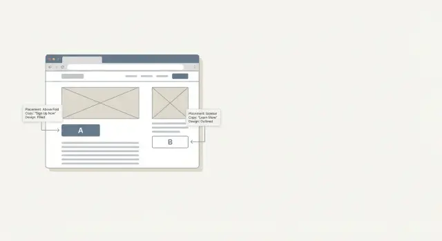
Variant A keeps it honest. After the final paragraph, add a short block that matches what the reader just learned: “Want a checklist version of this guide and a few more examples? Get it by email.” Add a plain note nearby: “No spam. Unsubscribe anytime.”
Variant B is a separate test (not something you run at the same time as Variant A). Try a soft mid-article prompt after a key step, then keep the end CTA similar to Variant A. If you test Variant B, keep everything else unchanged so you know what caused the shift.
Watch more than signups. Trust shows up in side signals:
- Signups (primary)
- Scroll depth or time on page
- Return visits within a week
- Complaint emails or replies like “I thought this was free”
Decide ahead of time what you’ll prioritize. For example, you only declare a winner if signups rise and complaints don’t.
Next steps: build a repeatable CTA testing habit
The easiest way to keep CTA testing honest (and not chaotic) is to make it boring. Pick one page template and start there so results compare apples to apples. When every article has a different layout, you end up testing the page, not the CTA.
A simple monthly rhythm works: one careful test per month beats five rushed tests you never review. Keep a small backlog of ideas so you’re not making last-minute changes that confuse readers.
For scale, it helps to standardize how you create and track variants across many pages. If you already use an all-in-one content platform that can generate adaptive CTAs and track performance, you can keep experiments consistent across templates. For example, GENERATED (generated.app) can generate CTA variants and track performance, which makes it easier to run clean tests as long as you keep the offer constant and apply the same guardrails.
Keep your reporting lightweight and repeatable:
- What changed (one sentence)
- Where it ran (page type, traffic sources)
- Primary metric result
- One trust metric result
- What you learned and what you’ll test next
Treat every test like a lab note. The habit is the advantage, not the single winning button.
FAQ
When should I start A/B testing CTAs on an informational page?
Start when the page has steady traffic and your offer delivers what the CTA promises. If you can’t measure results reliably or you’re still changing the article’s core message, wait and fix those basics first.
Why do CTA tests feel riskier on informational content than on sales pages?
Because readers came to learn, not to be sold to. A louder, pushier CTA can feel like an interruption or a broken promise, which can reduce trust even if clicks go up.
What should I measure besides CTA clicks?
Clicks alone aren’t enough. Use one primary conversion goal, then pair it with one reader-experience metric like scroll depth or time on page to make sure the page stayed easy to read.
What are the signs I shouldn’t run a CTA test yet?
Don’t test yet if traffic is low, reader intent is unclear, the landing page or product flow disappoints, or you’re changing multiple big things at once. Those situations make results noisy and can harm the page for no good reason.
What are safe CTA elements to test on informational pages?
Placement, wording that stays truthful, button vs. text link, a short support line that explains what happens after the click, and small friction changes when the offer is genuinely the same. These improve clarity without changing what the article is saying.
What CTA tests should I avoid because they can mislead readers?
Avoid bait promises, fake urgency, fear-based wording that clashes with the article tone, and testing totally different offers against each other. If a reader would feel misled after clicking, it’s not a valid test.
How do I run a simple CTA A/B test without confusing results?
Keep the article content identical across variants and change one CTA variable only. Write a single hypothesis, set a fixed duration, and decide your winner rule before you look at results.
Where should I place a CTA so it feels like a helpful next step?
A reliable approach is to give value first, then ask. Common reader-friendly placements include after the first clear answer or key takeaway, inline near a directly relevant section, and at the end for readers who finished the article.
How do I write CTA copy that doesn’t feel salesy on an educational page?
Use specific, plain promises that match the reader’s mindset, like “Download the template” or “See examples,” and add a short line explaining what happens next. Clarity reduces frustration and helps the right people click.
How can I check that my CTA won’t damage trust before publishing?
Make it obvious what happens after clicking and state requirements upfront, like email signup, account creation, or payment. Also ensure the CTA can be ignored without blocking reading, especially on mobile, so it never feels like a trick.